Android 17’s Large‑Screen Rules: A 60‑Day Plan
Android 17 large-screen rules are here—and they’re not optional. When your app targets API level 37, the OS will ignore attempts to force a fixed orientation or dodge resizability on devices with a smallest width of at least 600dp (most tablets, foldables, and desktop‑mode windows). In practice, that means your layouts must adapt, your navigation must unfurl across panes, and your media and camera flows must behave across posture changes.
Here’s the thing: Google is targeting Platform Stability for March 2026, with final release in Q2 and a minor SDK refresh in Q4. That’s enough time to modernize without blowing up your roadmap—but only if you treat this as a product requirement, not a side quest.
What Android 17’s large‑screen rules actually change
Let’s get precise. On large screens (sw ≥ 600dp) when you target Android 17 (API 37):
• Manifest values like screenOrientation that lock portrait/landscape are ignored.
• Runtime calls like setRequestedOrientation() no longer pin orientation on large screens.
• Attempts to constrain aspect ratios or opt out of resizeable activity behavior don’t stick.
Phones below 600dp smallest width aren’t affected by this enforcement. But if you’ve been relying on orientation locks or phone‑sized windows on tablets, Android 17 will surface those shortcuts to users—and to your crash logs.
Why this matters for product and revenue
Two user behaviors drive this policy. First, tablets and foldables are increasingly used like laptops: split‑screen, freeform windows, and external displays. Second, users punish apps that feel “phone‑blown‑up.” If your catalog depends on browsing plus detail (commerce, media, productivity), unoptimized large screens quietly tax conversion—more taps, more back‑stack confusion, and more exits.
There’s also a technical kicker. Android 17 tightens camera transitions and audio behavior, and it’s pushing performance work (e.g., fewer missed frames and smarter GC). Those wins only help if your UI can stretch without jank. Adaptive is no longer a nice‑to‑have; it’s the cost of distribution.
The pragmatic 60‑day upgrade plan
I run this upgrade as two tracks—Environments and UI—so the team unblocks early. Timeboxes assume a small cross‑functional squad (1–2 Android, 1 designer, 1 QA) with part‑time support from product and analytics.
Week 1–2: Baseline and pin dependencies
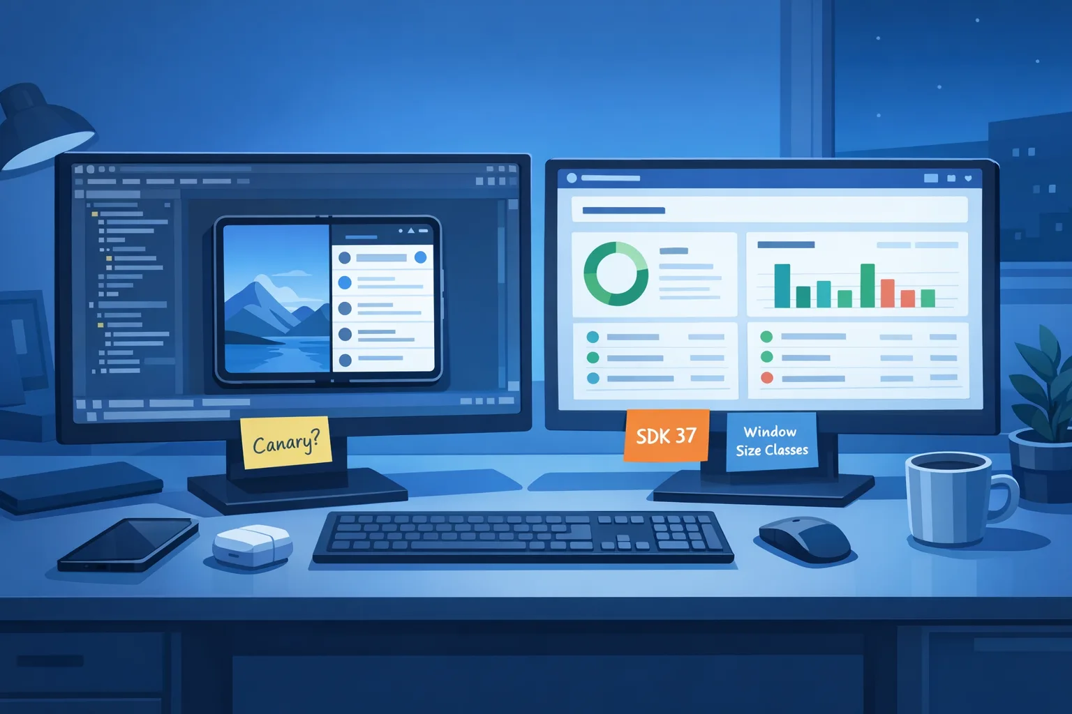
• Opt devices into the Android 17 Beta and stand up a canary lane in CI. Treat it like production: OTA updates, smoke tests, and build break alerts.
• Freeze orientation hacks. Search your codebase for setRequestedOrientation, hard‑coded screenOrientation, resizeableActivity, and min/max aspect ratio. Open tickets with owners and impact notes.
• Upgrade to current Android Gradle Plugin and the latest stable Jetpack libraries you can adopt safely. At minimum, take androidx.window (WindowManager) and ensure your navigation stack tolerates configuration changes.
• Capture gold‑path sessions on a tablet and a foldable. Record tap counts and abandonment points so you can prove the business impact later.
Week 3–4: Layouts and navigation
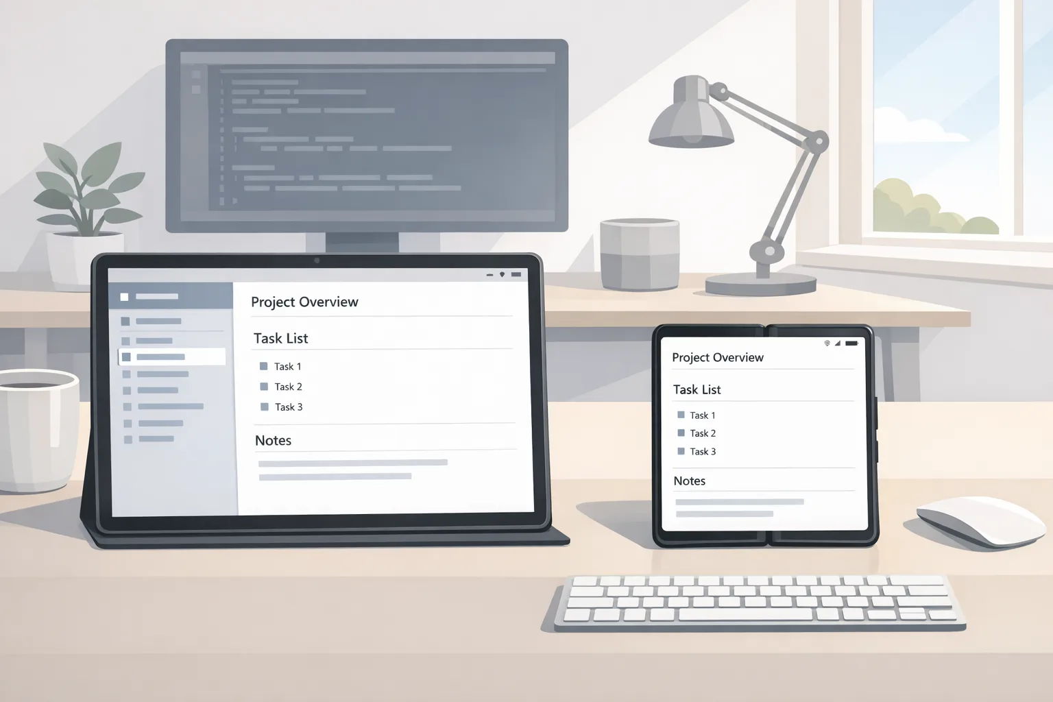
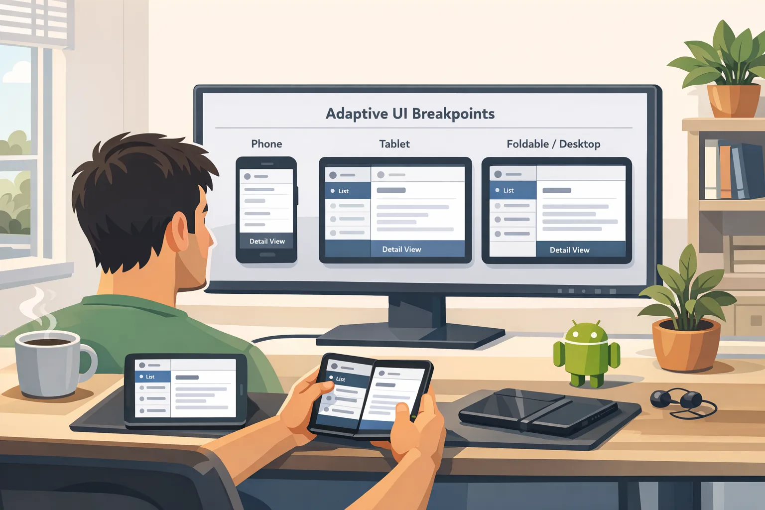
• Introduce canonical breakpoints: compact (phone), medium (portrait tablet), expanded (landscape tablet/desktop window). Use WindowSizeClass or simple 600/840dp checks.
• Move to list‑detail or two‑pane where it matters: browsing, settings, and creation flows. Consider ActivityEmbedding for hybrid View stacks or Navigation Compose for modern setups.
• Make your bars elastic. Toolbars, FABs, and bottom nav should scale or shift; don’t center a giant FAB in a sea of whitespace.
• Audit media and camera flows. Ensure previews, aspect ratios, and rotation listeners behave across folds and windows. Simulate hinge postures and external displays.
Week 5: Tablet QA and performance sweeps
• Run an orientation stress test: rotate rapidly, drag split ratios, open external displays, then fold/unfold mid‑capture. Watch for memory churn and fragment leaks.
• Add macrobenchmarks for start‑up and scroll jank on expanded layouts. Tablet UIs hide latency because there’s more space; users still feel it in their fingers.
• Triage accessibility. Larger canvases reveal contrast gaps, small hit targets, and focus traps.
Week 6: Release and learn
• Roll out as a staged update to tablet and foldable cohorts first. Use feature flags to keep phones on the prior layout for one release if needed.
• Monitor crash signatures tied to windowing and orientation APIs. Triage anything touching camera, media, and dialogs.
• Compare conversion and task completion against your Week‑1 baseline. Keep the variants with fewer taps and fewer back navigations.
Checklist: pass Android 17 on large screens
Use this as your go/no‑go gate before targeting API 37:
• No orientation locks or forced aspect ratios in manifest when sw ≥ 600dp.
• No runtime calls that attempt to pin orientation on tablets/foldables.
• Navigation supports split‑pane or list‑detail where appropriate; back stack is consistent across modes.
• Dialogs, sheets, and menus size sanely in expanded windows; no edge‑to‑edge monstrosities.
• Media players adapt video surfaces; controls remain reachable in both orientations.
• Camera preview and capture stabilize across folds and window resizes.
• Keyboard/pointer interactions: hover, right‑click, and tab order feel desktop‑competent.
• Accessibility passes: contrast, touch targets, and talkback paths validated at expanded sizes.
• Performance budgets set for expanded layouts (first meaningful render, scroll jank).
• Test matrix covers tablet portrait/landscape, foldable half‑open, split‑screen, and external display.

People also ask
Do I have to rewrite my app to meet Android 17’s large‑screen rules?
No. Most teams succeed by refactoring navigation and a few high‑leverage screens. Use two‑pane patterns for browse‑and‑detail, stretch toolbars, and audit dialogs. Reserve rewrites for places where state management can’t survive rotation or resize.
What happens if I keep min/max aspect ratio and orientation locks?
On large screens, Android 17 will ignore those instructions once you target API 37. Users will be able to resize and rotate; if your UI can’t cope, you’ll see layout explosions or stuck states. Treat every ignored constraint as technical debt to retire now.
Does this affect phones?
Not directly. The enforcement applies to sw ≥ 600dp. But testing on phones still matters because refactors can touch shared components, theming, and state.
When is the real deadline?
Google is targeting Platform Stability for March 2026, with final Android 17 release planned for Q2 and a minor SDK refresh in Q4. Many OEMs will lag, but Play’s target API requirements will eventually pressure upgrades. If you adapt in the next 60 days, you’ll be ahead of both Google’s schedule and your competitors.
Edge cases and gotchas I keep seeing
• Camera + rotation: preview surfaces freeze or stretch when the window resizes mid‑capture. Lock the camera pipeline to view lifecycle and recalc transforms on posture change.
• Video players: subtitle rendering and controls drift on large canvases. Anchor controls to safe regions, not absolute centers.
• Immersive games and kiosk modes: these are special. Some experiences may still need full‑screen hints or app‑specific UX. Budget extra test time and consider delaying targetSdk bump until your vendor stack catches up.
• Dialog farms: legacy apps with many blocking dialogs feel awful on tablets. Consolidate into sheets or side panels where it improves flow.
• Pointer support: bigger screens attract keyboards and mice. Add hover states and ensure context menus and drag‑and‑drop feel natural.
Dates to pin on your wall
• February 2026: Android 17 Beta 1 lands with the large‑screen enforcement preview and the new Canary channel for OTA testing.
• March 2026: Platform Stability targeted—final SDK/NDK APIs and app‑facing behaviors solidify.
• Q2 2026: Android 17 final release planned; this is your public user exposure window.
• Q4 2026: Minor SDK refresh planned; expect additional APIs, not breaking UI behavior.
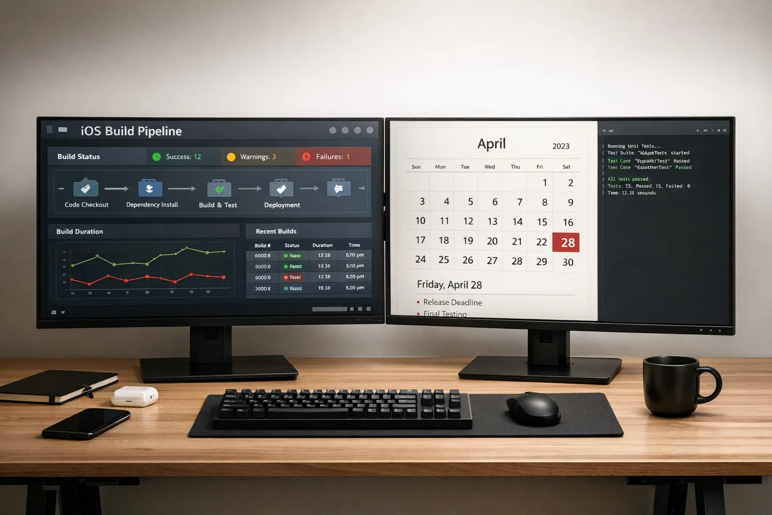
• April 28, 2026: On iOS, Apple begins enforcing Xcode 26‑series SDKs for App Store uploads—use that date as a cross‑platform planning anchor.
Tooling: picks that shorten the path
• WindowManager + ActivityEmbedding: reliable way to detect size classes and lay out two‑pane without reinventing split logic.
• Navigation Compose (or Navigation with fragments if you must): refactors back stack and makes adaptive patterns easier.
• Macrobenchmark + JankStats: quantify tablet performance; don’t trust eyeballing on a 12‑inch canvas.
• R8/ProGuard audits: expanded layouts load more at once—trim dead code and heavy resources to keep RAM steady.
Cross‑platform heads‑up for iOS teams
Shipping on both stores? Mark your calendar: Apple enforces Xcode 26 SDK builds starting April 28, 2026. If your marketing plan spans May, you’ll want Android 17 readiness and your iOS toolchain upgrade done by mid‑April. We’ve outlined no‑drama iOS plans in our April 28 ship guide; use those tactics to avoid CI surprises.
Examples to copy (and adapt)
• Commerce list‑detail: left pane for filtered results, right pane for PDP; use a collapse threshold at 720–840dp so portrait tablets stay single‑pane where it’s cleaner.
• Creator apps: timeline or layer stack on the left, canvas on the right; toolbar relocates to top on expanded, bottom on compact.
• Reading/news: two‑pane browse and article with sticky table of contents; in compact, push the TOC into a bottom sheet.
If you’re short on time, prioritize these three things
1) Kill orientation locks on large screens.
2) Convert your most important browse‑and‑detail flow to two‑pane.
3) Harden camera/media across resizes and postures.
What to do next
• Stand up an Android 17 canary lane in CI this week; fail builds that regress on tablets.
• Book a 90‑minute working session to kill orientation locks and map size classes.
• Pilot two‑pane on a single, measurable journey (e.g., PDP or settings).
• Stage rollout to tablet and foldable cohorts with targeted analytics.
• If you want a fast outside perspective, our team can help—see our Android app modernization services, our deep dive on the new large‑screen rules, and the developer checklist that matters.
Zooming out, Android 17 large-screen rules push the ecosystem toward better software. Take the hint, do the work, and you’ll end up with a product that feels native on every device your users try. That’s not just compliance—that’s competitive advantage.

Comments
Be the first to comment.