Android 17 Beta: The New Large‑Screen Rules, Explained
Android 17 beta isn’t just another preview; it’s a line in the sand for large‑screen support. If your app still assumes a phone‑only portrait window or relies on fixed dimensions, you’ll feel the squeeze. Google is making adaptive layouts and resizable windows the default expectation across tablets, foldables, desktops, and multi‑window modes. The good news: Android 17 beta also ships performance gains, smoother multi‑camera transitions, support for VVC (H.266), and smarter audio loudness controls. The runway is short—platform stability is expected in March 2026, with a stable release targeted for Q2 2026—so let’s get your plan straight.
Why Google is tightening large‑screen requirements
For years, too many Android apps treated tablets and foldables like oversized phones. Users felt that. OEMs felt that. And Google clearly felt that. Android 17 beta formalizes what’s been brewing since multi‑window, split‑screen, and posture‑aware UIs took off: apps need to be resizable and orientation‑agnostic. You won’t be able to opt out of resizing or hard‑lock orientations to paper over layout issues. That pushes teams to adopt responsive UI patterns and test across a range of window sizes and device postures.
Here’s the thing: this shift isn’t about chasing “tablet features.” It’s about building one adaptive codebase that behaves predictably everywhere. That saves you from a long tail of device‑specific bugs and review‑blocking UX issues as more foldables and large tablets ship in 2026.
Android 17 beta at a glance: dates, devices, scope
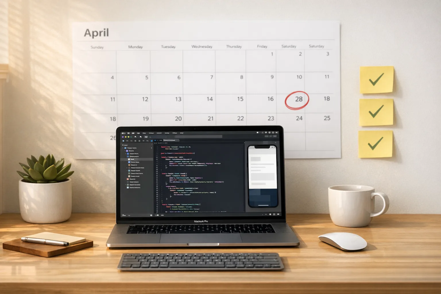
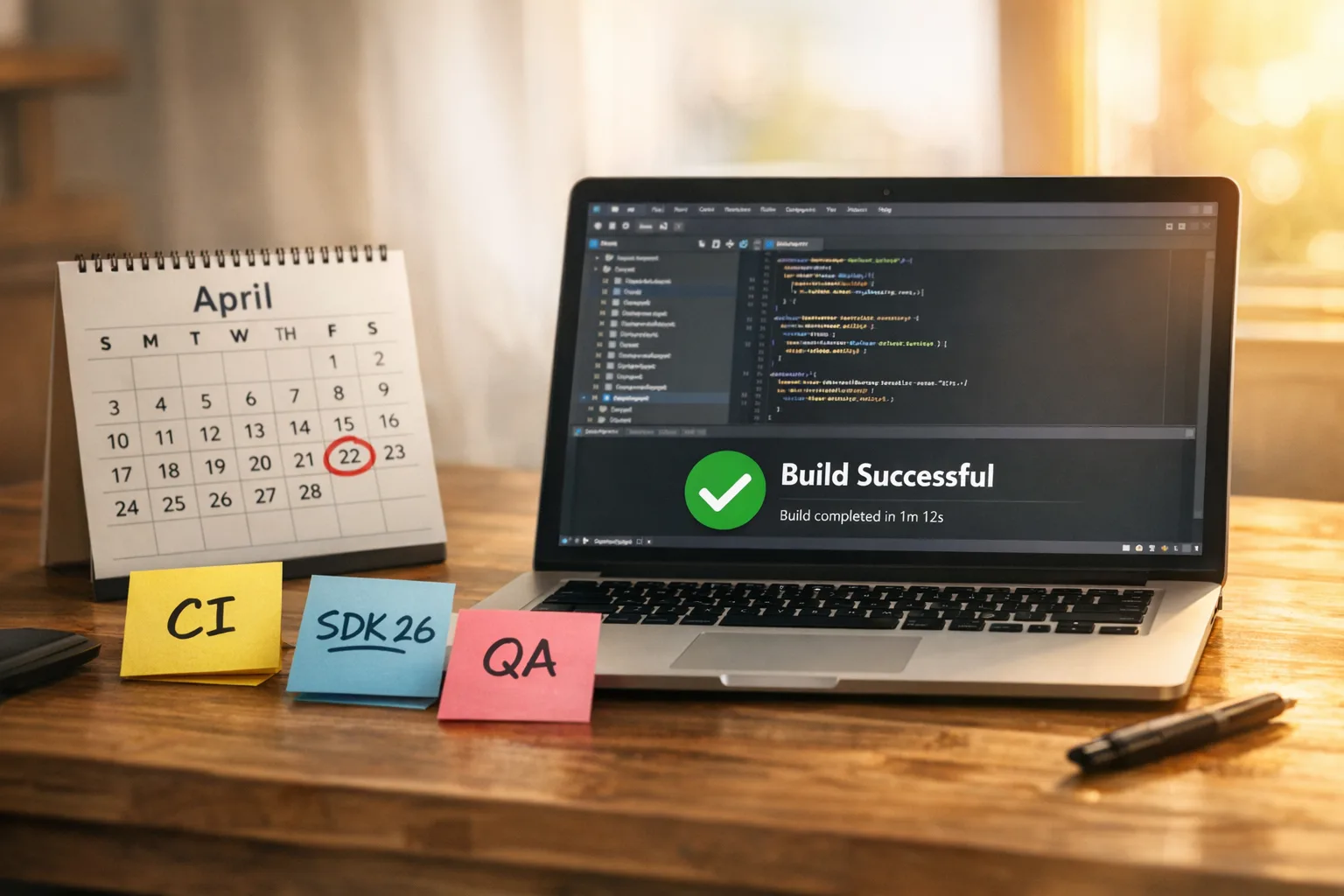
- Beta 1 landed February 13, 2026, for Pixel 6 and newer (including Pixel Tablet and Pixel Fold).
- Platform stability is slated for March 2026 (final SDK/NDK APIs; near‑final behaviors).
- Stable release is targeted for Q2 2026 (Google’s “26Q2” window).
If you’re a product owner, mark those dates. Engineers need production‑like APIs by platform stability, QA needs time to validate at multiple window sizes, and release managers should scope a compatibility update ahead of the stable roll‑out.
Primary changes developers will feel
1) Large‑screen and resizability enforcement
The headliner: you can’t force fixed sizes or orientations to dodge layout debt. Expect Play review and OEM stores to scrutinize apps that degrade on tablets, foldables, and desktop‑class windowing. Practically, this means your activities must be resizable, your layouts must respond to width/height classes, and your navigation should adapt as the window changes.
2) Smoother multi‑camera transitions
Android 17 beta introduces APIs and pipeline improvements to make switching between lenses feel professional. Think fewer exposure pops and faster transitions across ultra‑wide, wide, and telephoto. If you build camera‑centric experiences—AR, barcode scanning, streaming—test on multi‑lens devices and reduce any custom hacks you added to hide latency.
3) VVC (H.266) support
VVC can deliver higher quality at similar bitrates—or similar quality at lower bitrates—versus HEVC. Hardware support determines how far you can push it, so feature‑detect decoders at runtime and offer rational fallbacks (HEVC, AVC). For UGC or pro apps, a VVC option helps users save storage and bandwidth without a visible quality hit.
4) Audio loudness consistency
Android 17 beta tightens how loudness and background audio are handled. Apps that jump from whisper‑quiet to ear‑shattering between screens feel unpolished—and unsafe. Use standardized loudness targets and avoid manipulating stream types to punch through. If your app mixes media, voice, and UI sounds, audit them now.
5) Performance and connectivity wins
You’ll see fewer missed frames from better scheduling and garbage collection. Networking also gets smarter: proximity‑aware Wi‑Fi and more secure peer discovery reduce flaky connections and awkward pairing flows. That matters for companion apps, peripherals, and hands‑free experiences.
Android 17 beta: large‑screen requirements, in plain English
Let’s get practical. If you ship a consumer or enterprise app, here’s how to internalize the rules and the spirit behind them.
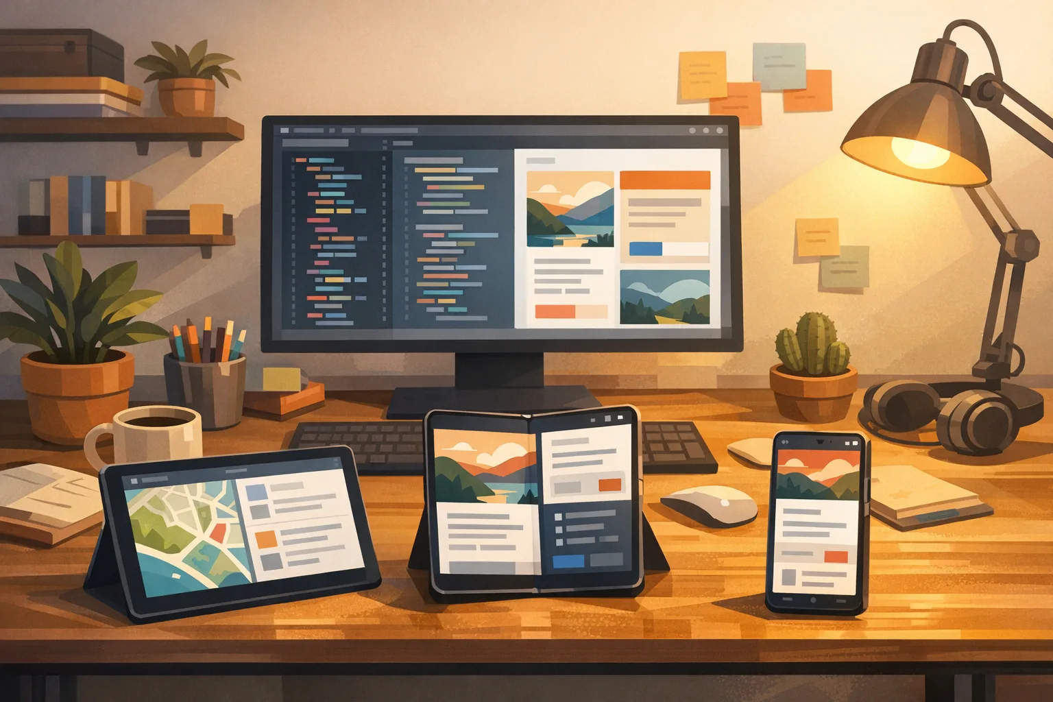
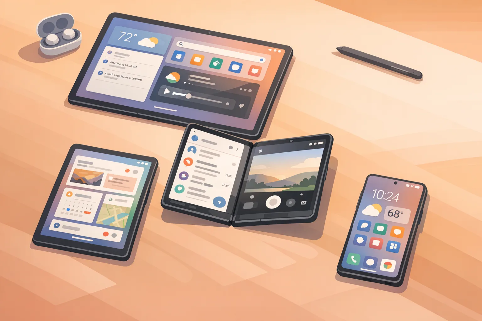
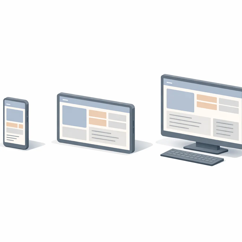
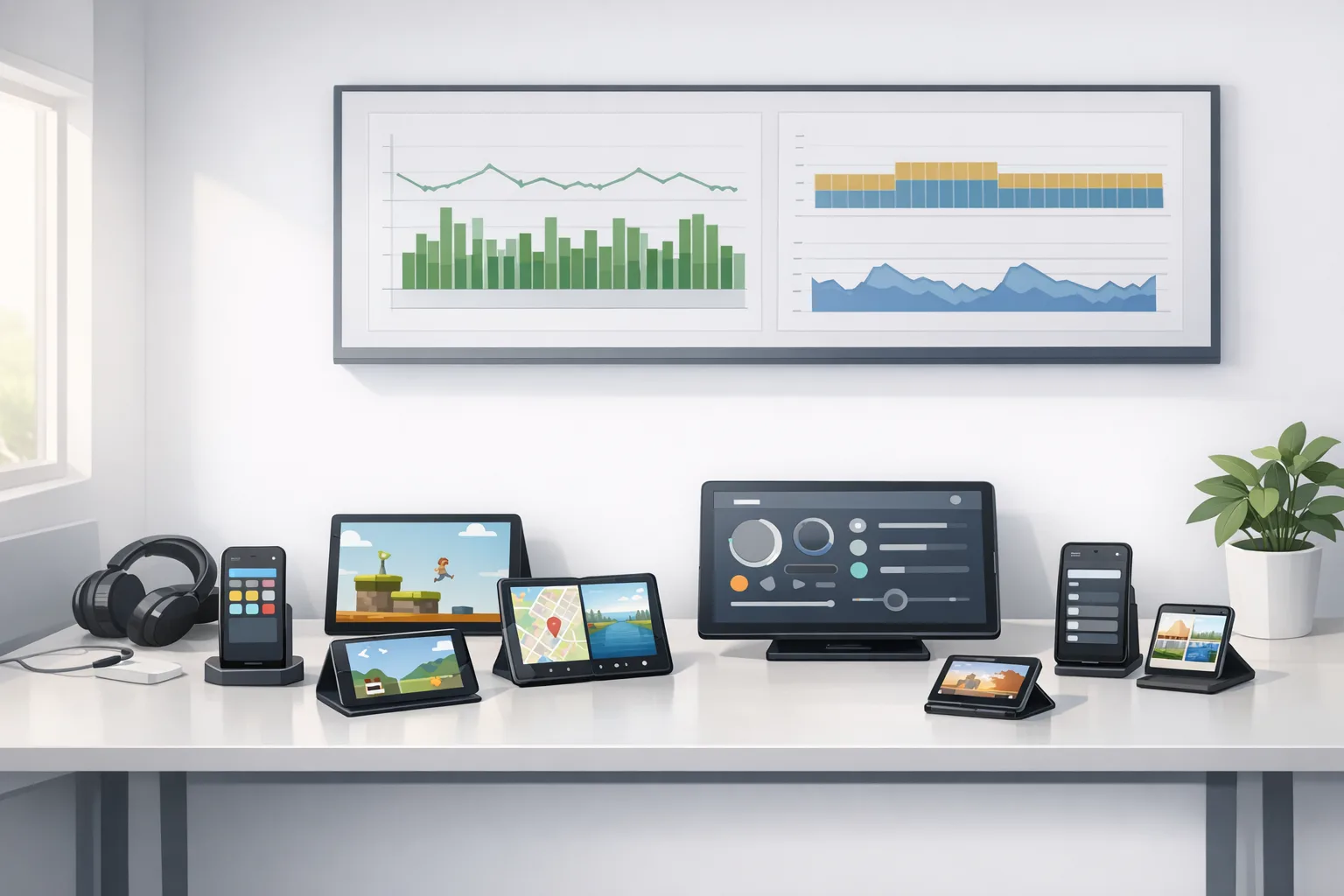
- Responsive by default: Assume your content may render at 480dp wide or 1280dp wide. A single stack‑nav layout won’t cut it.
- Orientation‑agnostic: Landscape shouldn’t feel like a widened portrait view. Reflow content and use dual‑pane layouts when it helps.
- Multi‑window resilient: Your app should survive being snapped into a narrow column next to another app—without clipped controls or hidden CTAs.
- Posture‑aware for foldables: Account for tabletop, book, and partially folded modes. Avoid critical content under hinges and creases.
Feature work you can ship this sprint
Adopt width/height classes with Compose or Views
Jetpack Compose’s adaptive layout patterns and Window Size Class make it straightforward to pivot between compact, medium, and expanded layouts. View‑based teams can mirror this using SlidingPaneLayout, ConstraintLayout, and resource qualifiers like sw600dp and sw840dp to express tablet‑first UI.
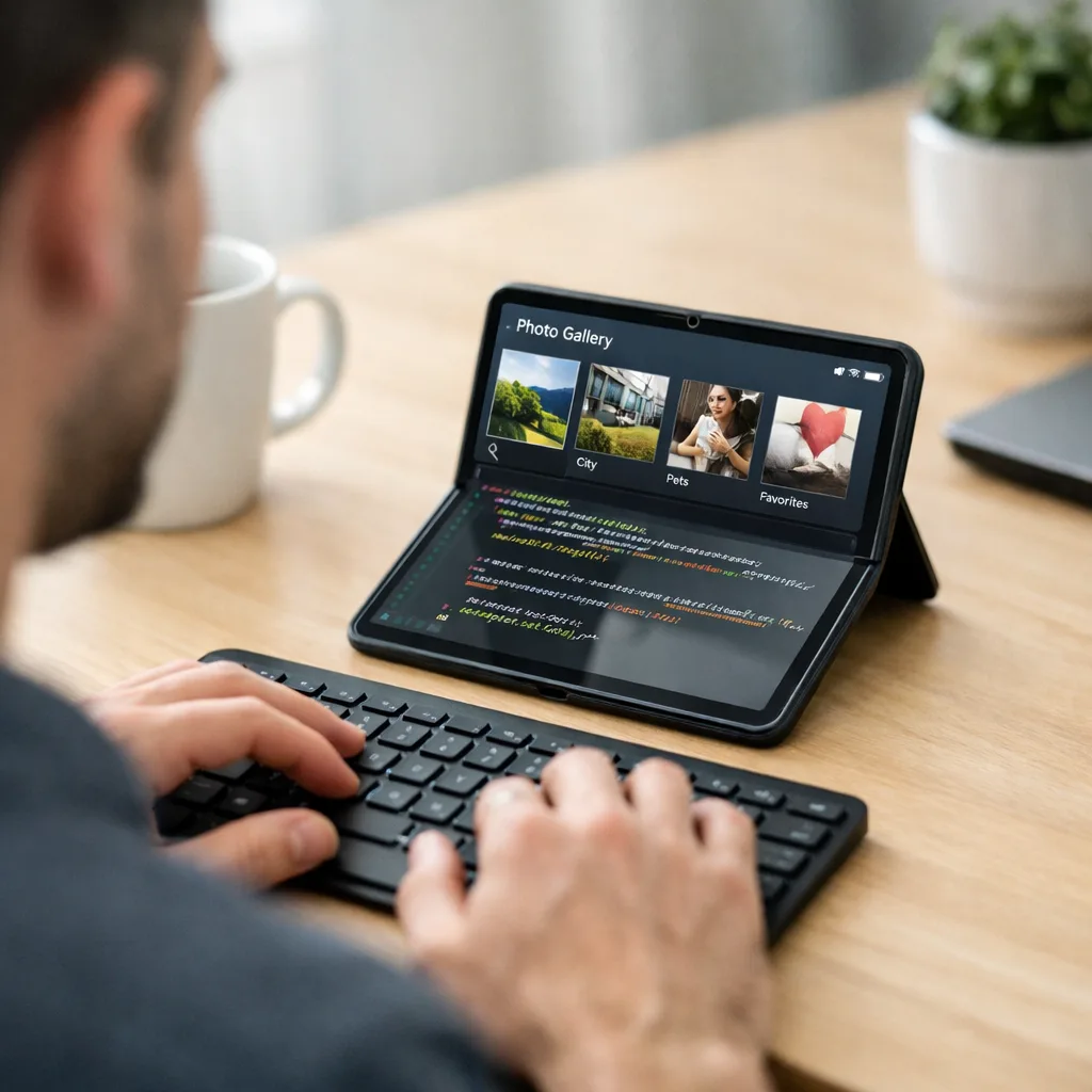
Design a dual‑pane system UI
Give medium/expanded widths a two‑pane experience: list on the left, detail on the right. On phones, collapse to a single pane with bottom navigation. On foldables in tabletop posture, consider splitting controls to the lower panel and content to the upper panel to reduce reach.
Make navigation scale
Bottom nav for compact widths, a navigation rail for medium widths, and a persistent drawer for expanded widths. Keep destinations identical across modes to prevent user confusion when resizing.
Guard against content cliffs
Audit scrolling containers, grids, and carousels. Ensure your typography and image aspect ratios have rules that scale. Add min/max columns for grids, and never anchor buttons to absolute coordinates.
A 10‑day “Large‑Screen Readiness” plan
This is the exact playbook we’ve used to rescue Android tablet and foldable launches on short timelines.
- Day 1: Inventory screens and states. Export a list of top flows. Tag which ones are compact‑only, which break at 600dp, and which need dual‑pane variants.
- Day 2: Define size classes. Agree on breakpoints (compact, medium, expanded) and navigation patterns per class. Lock them in with design.
- Day 3–4: Implement adaptive scaffolds. Introduce a shared layout component (Compose Scaffold or View shell) that swaps nav patterns and panes based on size class.
- Day 5: Fix data density and typography. On expanded widths, add richer lists, secondary metadata, and hover/focus affordances for keyboard/mouse users.
- Day 6: Foldable postures. Use WindowManager to detect posture; move interactive elements away from the crease. Test tabletop and book modes.
- Day 7: Camera & media pass. Replace custom cross‑lens hacks with the new smoothing behaviors where applicable. Add VVC as an opt‑in codec with hardware checks; fall back to HEVC/AVC.
- Day 8: Audio loudness audit. Normalize targets, remove stream‑type abuses, and verify background behavior meets policy.
- Day 9: Performance and jank. Profile frame times, fix overdraw, and cache expensive composables/views. Add Macrobenchmark tests to catch regressions.
- Day 10: QA matrix. Test at three size classes, landscape/portrait, and at least one foldable posture. Create screenshots per class for your store listing.
People also ask: quick answers
Do I need to rebuild my app for Android 17 beta?
You don’t have to rebuild today unless you’re targeting new APIs. But you do need to validate resizability and layout behavior now, because Android 17’s stable release will set expectations your users and reviewers will hold you to.
How strict are the new large‑screen rules?
Strict enough that apps banking on fixed sizes or locked orientations will look broken on more devices as 2026 progresses. If you already use adaptive layouts, you’re close—focus on foldable postures and polish.
Will adopting VVC break compatibility for older phones?
No, if you detect codec support at runtime and provide fallbacks. Treat VVC as a premium option where hardware exists; keep HEVC/AVC as defaults for breadth.
Ship‑proofing: test matrix you can copy
Run this on every PR that touches UI, media, or navigation:
- Size classes: 360–480dp (compact), 600–840dp (medium), 1000dp+ (expanded).
- Orientations: Portrait and landscape for each class.
- Postures: Folded, half‑open tabletop, full‑open (for at least one foldable).
- Input methods: Touch, keyboard, trackpad/mouse—verify focus rings and hover states.
- Media: VVC on supported hardware, HEVC/AVC fallback; cross‑lens camera switch.
- Audio: Loudness targets and background policy compliance across screens.
What about performance? Wins you can bank today
Android 17 beta’s frame scheduling and GC improvements reduce jank, but you still need to meet it halfway. Cache bitmaps and expensive composables, precompute layout where sensible, and avoid layout thrash during window resize. If you render large data sets, adopt paging and lazy layouts with sensible prefetch windows.
On the networking side, pair devices using proximity‑aware Wi‑Fi and updated peer discovery to cut failed pairing attempts. That single change has outsized impact on wearables, health peripherals, and enterprise scanners.
Cross‑platform heads‑up for iOS teams
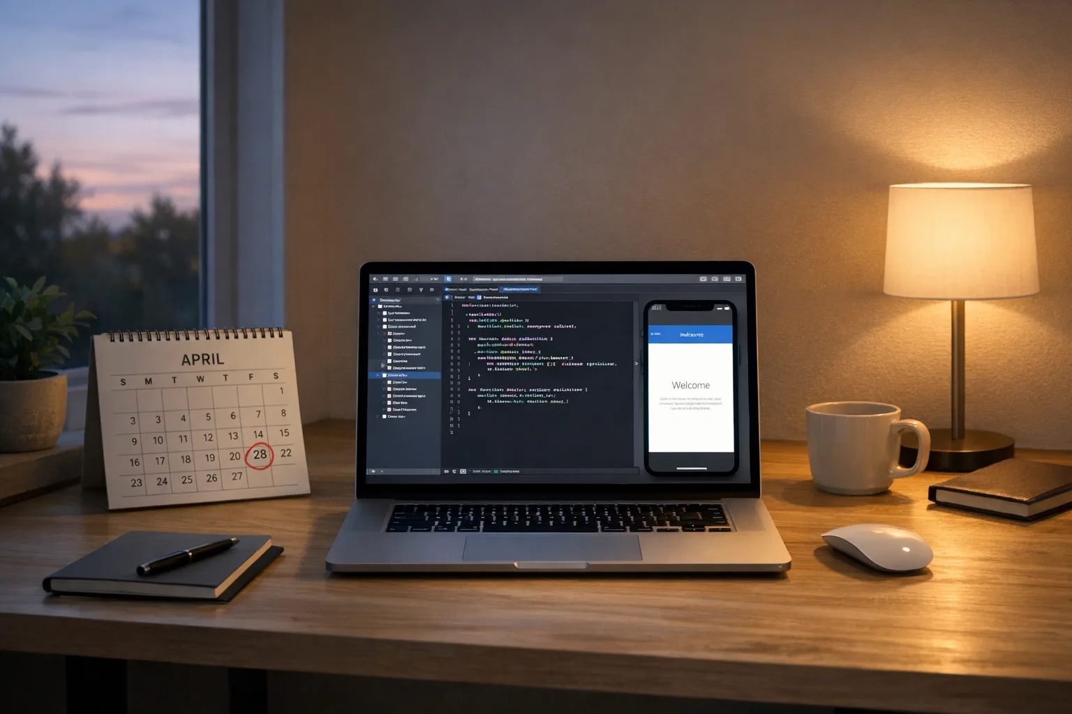
While Android 17 beta tightens large‑screen behavior, Apple is also raising the bar. Starting April 28, 2026, new uploads to App Store Connect must be built with the current toolchain and SDKs. If your organization runs dual‑track releases, put Android resizability and your iOS toolchain cutover on the same calendar to avoid a crunch. For a practical iOS playbook, see our guide to shipping before the April 28 App Store Connect cutoff.
Stakeholder brief: how to scope this work
For PMs: treat “Tablet/Foldable Ready” as a measurable release criterion. Define the three size classes, the dual‑pane experience, and the foldable posture behavior in your PRD. For designers: build component variants per size class and document collapse rules. For engineering: one adaptive scaffold plus a navigation strategy that swaps patterns across classes will do most of the lifting.
For leadership: this isn’t a vanity upgrade. A resizable, posture‑aware app improves ratings, reduces support tickets from large‑screen users, and shortens future device‑bring‑up time. It’s a one‑time investment with compounding returns.
Gotchas and edge cases we’ve seen in the wild
- Dialog traps: Fixed‑width dialogs that overflow in narrow split windows. Convert to bottom sheets or responsive modals.
- Map + sheet fights: Gestures conflict when the map and a sheet both steal vertical scroll. Use nested scroll and clearly defined drag thresholds.
- Camera preview stretch: Hard‑coded aspect ratios break on folded devices. Query sensor crop regions and compute previews dynamically.
- Immersive UI: Fullscreen flags clashing with resize. Recalculate insets on each size change and keep gesture nav affordances visible.
- Drag‑and‑drop: On desktop‑class environments, users expect file drag‑in/out. Add it where it makes sense; it’s a small lift with big usability payoff.
What to do next
- Enable the Android 17 beta on a Pixel test device and run a half‑day exploratory on your top five flows.
- Adopt size classes and ship a dual‑pane layout for at least one critical screen.
- Add VVC as an optional codec with runtime detection; keep safe fallbacks.
- Schedule a camera and audio audit: transitions, exposure behavior, and loudness targets.
- Stand up a QA matrix for size/orientation/posture and automate screenshots per class.
- If you need hands‑on help, explore our mobile app development services and see how we structure adaptive UI engagements.
Want a deeper dive?
We break down the larger policy and UI moves in our companion analysis of Android 17’s new large‑screen rules. And if you’re juggling multiple platform deadlines this spring, our engineering blog has ship‑ready playbooks, including App Store Connect timelines you can mirror in your Android roadmap. If you’d like to see how we translate this into production code, browse our portfolio of shipped mobile apps.
Final take
Android 17 beta sets a new bar: resizable, posture‑aware, and performance‑conscious apps are the baseline going forward. If you tackle size classes, dual‑pane layouts, and camera/media updates this month, you’ll meet the moment—and reduce long‑term maintenance pain. Ignore it, and the universe of devices where your app feels broken will grow with every foldable, desktop mode, and big tablet sold in 2026. Let’s get the work done now, while the APIs and behaviors are settling.
Comments
Be the first to comment.