Android 17 Beta: The Large‑Screen Rules That Stick
Android 17 Beta changes the deal for tablets and foldables. For the first time, the platform enforces non‑negotiable large‑screen behavior: on devices with a smaller dimension around 600dp or more, apps can no longer rely on orientation locks or squeeze out of resizable windows. If your layouts assume portrait, Android 17 Beta will expose those assumptions fast. That’s why we’re treating Android 17 Beta as a shipping milestone, not just a curiosity.
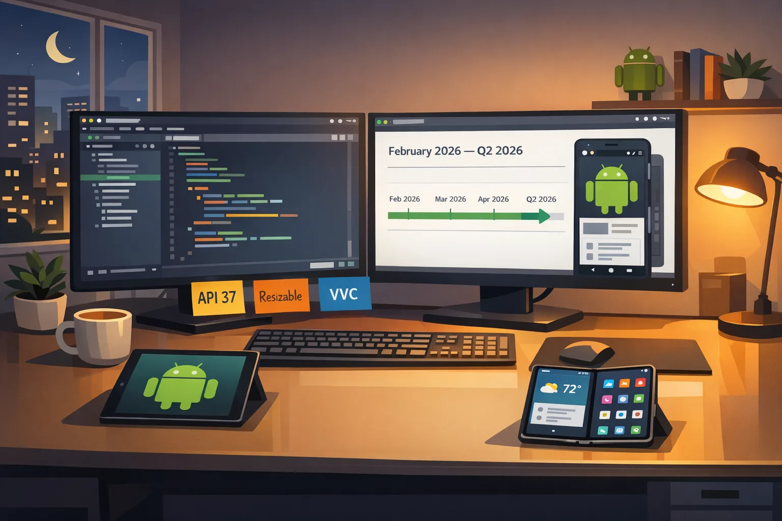
Let’s get the ground truth straight. Beta 1 landed on February 13, 2026 for Pixel 6 and newer hardware. Google is aiming for platform stability in March 2026, with the platform release tagged for Q2 2026. The SDK is API level 37. That timeline matters because it compresses your testing window—and the enforcement lands whether you’re ready or not.
What the Android 17 Beta enforces on large screens
Here’s the thing: Google isn’t just nudging you—it’s taking away your escape hatches on large screens. On sw≥600dp devices, several manifest attributes and runtime calls are effectively ignored. That means orientation locks and aspect‑ratio tricks won’t constrain your UI anymore, and forcing a fixed layout is off the table when the app sits in a resizable or multi‑window context.
Specifically on large screens, the system ignores:
- Orientation locks specified via screenOrientation in the manifest.
- Runtime orientation changes via setRequestedOrientation().
- Opting out of resizing via resizeableActivity.
- Aspect‑ratio constraints via minAspectRatio and maxAspectRatio.
Two clarifications developers keep asking me about: phones and small slates are not subject to this enforcement; they’ll behave as before. And yes, multi‑window on tablets and desktops is part of the reality you must design for—there’s no switch to make it go away. If your app letterboxes or relies on one tall column, that layout debt is due.
Behavior shifts you’ll feel immediately
- Launches into landscape when the device is docked? Your app must render a useful layout, not an awkward stretched phone UI.
- Freeform windows on large screens? Your navigation components and list/detail panes must adapt without clipping or phantom whitespace.
- Rotations mid‑flow? Your state can’t reset or lose user progress; the platform expects continuity.
Android 17 Beta performance gains you should bank right now
The enforcement headlines draw attention, but Android 17 Beta quietly ships runtime wins that are too good to ignore. There’s a lock‑free MessageQueue implementation aimed at cutting missed frames under contention. There’s also a generational garbage collector tuned to reduce CPU overhead and shorten pause tails in warm UIs. If you hold a busy main thread with frequent dispatches or animation bursts, you’ll see smoother frame pacing without heroic app‑side hacks.
Media is getting love too. Camera transitions are more graceful—swapping lenses and switching modes is less likely to stutter or freeze previews. And the platform continues rolling out support for newer codecs like VVC (H.266). If your product leans on creator workflows, media uploads, or on‑device review, these are not theoretical perks; they surface in your crash metrics and session duration.
The R.E.S.I.Z.E. migration playbook
I use this six‑step sequence with teams to get from “works on my phone” to “ship‑ready on tablets, folds, and desktops.” Apply it in order—each step sets up the next.
R — Remove hard orientation and aspect locks
Start by deleting the crutches Android 17 Beta will ignore anyway—manifest screenOrientation, minAspectRatio, maxAspectRatio, and any setRequestedOrientation() calls. If you still need a portrait‑first experience on phones, gate it behind a runtime check for window size class so you’re not relying on deprecated constraints on large screens.
E — Embrace window size classes and canonical breakpoints
If you’re on Jetpack Compose, define compact/medium/expanded breakpoints and refactor top‑level screens to choose layouts by size class, not by orientation. In XML, the same principle applies: use sw qualifiers and constraint sets keyed to available width. The goal is predictable, testable swaps: single‑pane lists in compact, list/detail in medium, and tri‑pane or persistent sidebars in expanded.
S — Stabilize state across rotations and resizes
Android 17 reduces activity restarts for some configuration changes, which is great unless you depended on those restarts to refresh resources. Treat state as first‑class: ViewModels own business state; SavedStateHandle persists navigation‑critical fields; UI remembers scroll positions and text input. If you truly need recreation for a given change, opt in deliberately using the new manifest control, then regression‑test the flow.
I — Instrument performance before and after
Record jank and GC pauses on a known bad flow—think infinite carousel or heavy RecyclerView updates—on Android 16 and Android 17 Beta. Use frame timelines and profile traces to compare miss rates. These before/after numbers are gold in sprint reviews because they justify the layout and threading work you’re doing. Add a CI gate that fails builds if the jank budget regresses beyond a set threshold.
Z — Zero in on media, input, and multi‑window edges
Test camera mode switches while rotating and resizing the app; validate that previews don’t freeze and session lifecycles are clean. Exercise background audio when the app shrinks into a split pane. Try stylus, trackpad, and keyboard navigation on a Chromebook. Large screens magnify small papercuts—pointer focus rings, hover behaviors, and tooltip timing can make or break productivity feels.
E — Expand your QA matrix and rollout strategy
Make sure you’re testing on a tablet, a book‑style foldable, and a desktop‑class window (Chromebook or desktop emulator). Add Android 17 Beta emulators to CI and run daily large‑screen smoke tests. When platform stability hits in March, promote API 37 to your release branch, run a staged rollout, and watch crash‑free sessions by size class—not just by device model.
“Can I keep my app portrait‑only?” and other PAA‑style questions
Can I still force portrait with Android 17 Beta?
On phones and smaller slates, your existing behavior remains. On large screens, Android 17 Beta ignores orientation locks and related tricks. If your app’s UX is inherently portrait, design a robust compact layout for phones and a medium/expanded layout for tablets that keeps your core hierarchy intact without stretching.
Does Android 17 Beta apply to Chromebooks and desktop windows?
Yes. Resizable windows are a first‑class scenario for large screens. Expect your app to be dragged narrower and wider. Navigation rails that collapse into icons, responsive grids that change column counts, and multi‑pane patterns that degrade gracefully are table stakes.
When should I target API level 37?
Wait for platform stability in March to lock final app‑facing behaviors, then move your release branch to target 37. Keep an Android 17 Beta testing lane now so you’re not discovering layout bugs the week you bump targetSdk. Staged rollouts plus server‑side feature flags give you the safety net you want.
What breaks most often when teams first try this?
Third‑party SDKs that assume fixed orientation, ad and video overlays that don’t respect insets, and custom toolbars or bottom sheets that don’t re‑measure cleanly under window changes. Compose apps also surface subtle issues with lazy lists pinned to hardcoded widths—fix those by keying layout decisions to size classes instead of raw dp numbers.
Data and dates you should pin to your wall
- February 13, 2026: Android 17 Beta 1 available for Pixel 6 and newer.
- March 2026: Platform stability target—final SDK/NDK and app‑facing behaviors.
- Q2 2026: Android 17 platform release window.
- API level: 37 for Android 17.
If you run iOS in parallel, circle April 28, 2026: Apple requires Xcode 26 and the 26‑series SDKs for all new uploads. If you’re coordinating dual‑platform launches, align your Android 17 work with your Xcode 26 cutover so QA can hammer both platforms in the same test cycles. For a deeper iOS plan, see our April 28 ship playbook for Xcode 26.
A practical checklist you can run this week
Use this as your stand‑up agenda. It’s short on ceremony and long on outcomes.
- Delete orientation/aspect locks for large screens; add a WindowSizeClass gate for phones.
- Define three layouts per top‑level screen: compact, medium, expanded. Commit design tokens for breakpoints.
- Refactor navigation to support list/detail on medium and a persistent rail or sidebar on expanded.
- Harden state: ensure no data loss across rotation/resizing; verify deep links restore the same view model state.
- Profile one animation‑heavy flow on Android 16 vs Android 17 Beta; capture frame miss deltas and GC pause lengths.
- Exercise camera, audio, and picture‑in‑picture under resize; fix lifecycle leaks and stuck overlays.
- Add Android 17 Beta emulator runs to CI; fail the build on layout overflows, clipped text, or ANRs.
If you need deeper dives on layout patterns and test setups, our team’s large‑screen rules explainer and Android 17 developer checklist walk through real UI topologies and triage flows. When you’re ready to turn this into a delivery plan, our ship‑ready guide to large screens bundles the design system updates and QA matrices we use with product teams.
Risk ledger: what can still bite you
- SDK drift in CI. Local devs upgrade, but CI images stay pinned. Declare the Android Gradle Plugin, NDK, and emulator images explicitly and cache the toolchains. Verify the emulator skin and density actually represent a large screen.
- Insets and system bars. Multi‑window plus gesture nav surfaces awkward insets. Use insets‑aware containers and test hidden navigation bars; many ad overlays and video players still assume full‑screen and will clip.
- Pointer and focus handling. Large screens attract keyboards, mice, and styluses. Ensure hover states, focus outlines, and key navigation all make sense. Don’t ship a tablet app that’s mouse‑hostile.
- Accessibility regressions. When panes appear, tab orders and talkback focus often go haywire. Run automated checks, then do manual pass‑throughs with magnification and high‑contrast modes enabled.
- Third‑party UI kits. Some kits use fixed dp widths or read orientation to switch layouts. Patch or replace them; fighting your own toolkit is a time sink.
Delivery timeline you can defend in a steering meeting
Week of Feb 24: Kill orientation/aspect locks; add window size class scaffolding; pick two target screens for first conversion.
Week of Mar 2: Convert the home and primary content screens to responsive layouts; add list/detail on medium and a side rail on expanded. Land state fixes to survive rotation and resize.
Week of Mar 9: Run a focused performance sprint. Capture jank and GC numbers pre/post Beta on three devices. Address the worst offenders: over‑eager observers, layout thrash, or unnecessary recomposition.
Week of Mar 16 (Platform Stability target): Bump targetSdk 37 on a feature branch; start staged internal builds; regression‑test media and input devices.
Week of Mar 23: Close a11y and insets bugs; expand QA matrix to Chromebook and a second tablet; integrate ad/video SDK patches.
April: Promote API 37 to release; 10% production rollout; instrument by size class; monitor crash‑free sessions, ANRs, and layout‑related support tickets. Parallel iOS teams prep the Xcode 26 cutover for April 28 where relevant.
What to do next
- Add Android 17 Beta emulators to CI and schedule daily large‑screen test runs.
- Convert your two highest‑traffic screens to responsive layouts this sprint.
- Stabilize state and navigation; prove no data loss on rotate/resize.
- Profile one hot path and capture before/after frame miss deltas.
- Plan your API 37 bump for the platform stability week; stage carefully.
If you want hands‑on help—from layout audits to CI hardening—our team has shipped this playbook with consumer, fintech, and B2B products. See how we work on our mobile services overview and reach out when you’re ready to move.
Android has nudged large‑screen quality for years. Android 17 Beta stops nudging and sets rules you can’t dodge. Teams that lean into responsive layouts, state stability, and measured performance will roll into Q2 with calmer dashboards and happier users. The teams that wait will be fixing orientation bugs in production. Your call.
Comments
Be the first to comment.