Android 17 Beta: The Adaptive App Mandate
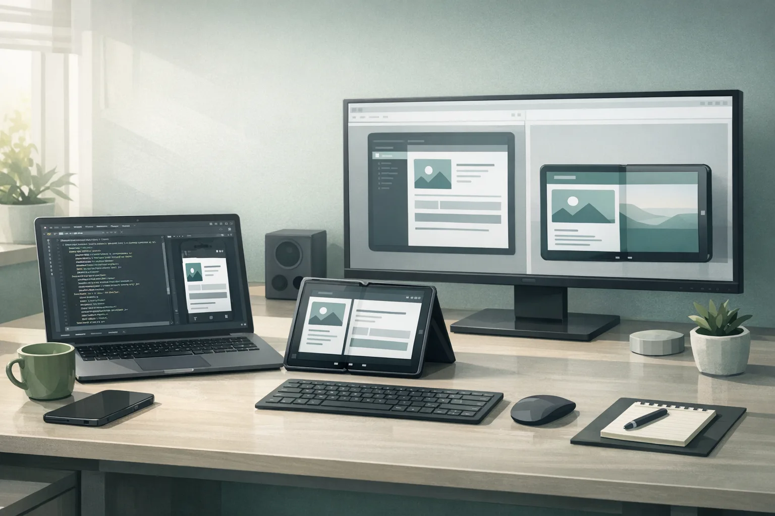
Android 17 Beta is here, and it moves adaptive app behavior from “nice to have” to table stakes. If your layouts still assume a phone‑sized portrait canvas, this release will surface the cracks fast—especially on tablets, foldables, and desktop‑style windowing. The punchline: you can no longer rely on opting out of resizability or fixed orientation on large screens, and Google’s new Canary channel means these expectations land earlier in your dev cycle.
I’ve spent the past few weeks upgrading a production app with millions of monthly users to pass the new large‑screen expectations while staying fast on mid‑range hardware. Below is the short version of what changed, what can break, and a practical plan you can run inside a 10‑day sprint. If you’re evaluating risk right now, the headline is simple: treat Android 17 Beta as your compliance bar, not a curiosity.
What actually changed in Android 17 Beta—and why it matters
Android’s adaptive roadmap has reached the enforcement phase. On devices with a smallest width around 600dp (think unfolded foldables, tablets, and desktop windowing), apps can’t assume a locked orientation or avoid resizable behavior. Practically, that means your UI must handle rotation, multi‑window, and live resize without jank or state loss. If your manifest still leans on non‑resizable activities or you hard‑coded portrait assumptions, plan to revisit those choices now.
There’s more under the hood. Android 17 introduces a generational garbage collector in ART aimed at cutting CPU overhead and reducing missed frames on real‑world devices. There’s also a lock‑free MessageQueue implementation for apps targeting the new SDK—great for throughput, but risky if you’ve been reflecting on internal fields in older pipelines or libraries. Media and camera apps get smoother session transitions, and support for modern video codecs steps forward. All of these tilt in your favor—if you test against them before you ship.
The end of Developer Previews: Canary is your new early track
Google replaced the stop‑and‑go Developer Preview cadence with an always‑on Canary channel. Translation: features and behavior changes reach you earlier, continuously, and over‑the‑air once you’ve flashed in. Expect less waiting and fewer late surprises, but more responsibility to keep an eye on breakage as the platform evolves through the quarter. You’ll still get the traditional Beta for broader testing, but your discovery time window starts much sooner.
Key dates and targets you should plan around
Here’s the timeline your team should use for resourcing and risk management:
February 13, 2026: Android 17 Beta 1 becomes available for Pixel 6 and newer. This is your go‑signal to begin serious compatibility and UX validation on large screens.
March 2026: Platform stability is targeted. Final SDK/NDK APIs and app‑facing behaviors settle. Your compatibility fixes should be code‑complete around this milestone so you can focus on performance and polish.
Q2 2026: Stable release window. In practice, many teams will align their public rollout to late Q2 once OEM timelines clarify. If you run staged rollouts, freeze app‑breaking toggles after stability and watch crash‑free rate and soft KPIs (time to first interaction, scroll jank, navigation error rate) across devices ≥600dp.
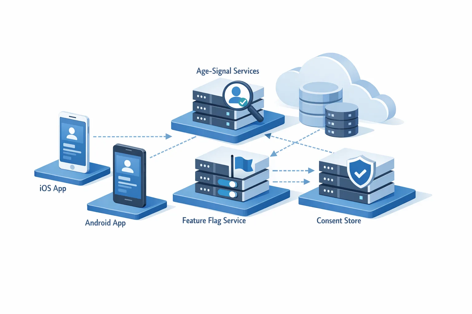
Android 17 Beta and the adaptive app mandate
Let’s unpack the non‑negotiables and the engineering moves they force:
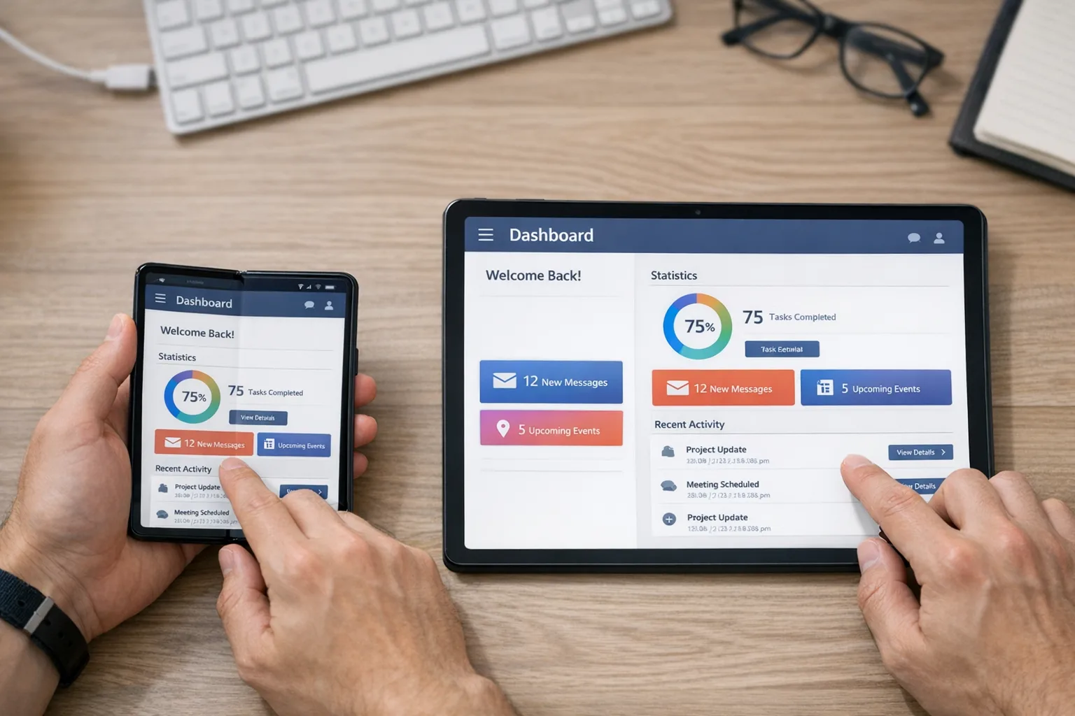
Orientation can change at any time. Treat rotation as routine, not an edge case. Your app must preserve state across portrait ↔ landscape, folding and unfolding, and window resizes. If you’ve been relying on fixed portrait with android:screenOrientation, that crutch won’t hold on large screens.
Resizable is assumed. Activities that refuse to resize will hit size compatibility modes and look broken. Declare resizeableActivity="true", but more importantly, make sure the UI actually adapts: panes, grids, and dialogs should scale and re‑flow, not just stretch.
Multi‑window is normal behavior. Expect users to run your app split‑screen with another app. Check that toolbars, bottom sheets, and snackbars remain discoverable in tighter vertical space. Verify drag‑and‑drop if your app claims it.
Windowed desktop environments exist. On Chromebooks and desktop‑style modes, maximize/restore and live resize are everyday interactions. Components shouldn’t pop or rebind aggressively when the window nudges a few dp wider.
Design patterns that survive live resize
Two patterns carry the heaviest load for adaptive apps:
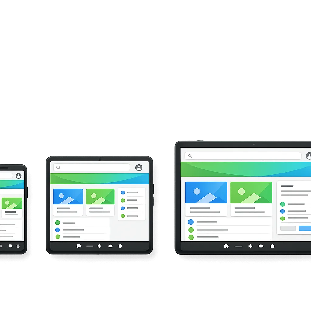
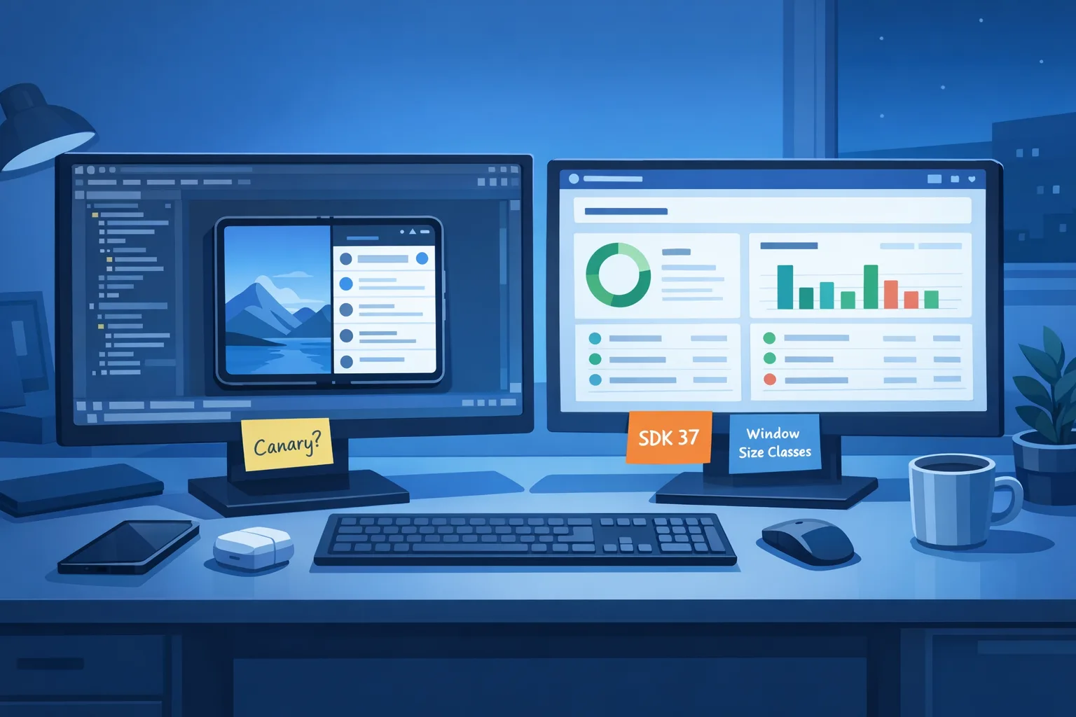
Window size classes. Bucket your UI by width/height classes (compact, medium, expanded). Use them to swap navigation models (bottom bar → navigation rail → two‑pane nav) and to upgrade content density (list → grid). Avoid “pixel‑perfect” switches; aim for smooth ramps with min/max widths and responsive breakpoints.
Two‑pane layouts. On expanded widths, show list+detail. Preserve scroll position and selection consistently during rotation and fold state changes. For Compose, build with AdaptiveLayout and state‑hoist aggressively; in Views, prefer SlidingPaneLayout or a custom two‑pane container with saved state handlers.
10‑Day upgrade plan: ship adaptive without blowing up the roadmap
Here’s a sprint plan I’ve used with success. It assumes one senior Android engineer plus design and QA support. Adjust for your app’s surface area.
Day 1: Baseline and breakpoints
Inventory every top‑level screen. For each, record: min viable width, ideal width, and which elements hide, collapse, or split as width grows. Define three breakpoints (e.g., ≤480dp, 481–839dp, ≥840dp) and map navigation models per class.
Day 2: Manifest and config hygiene
Remove orientation locks where possible. Set resizeableActivity="true". Audit configChanges—if you’ve been intercepting rotation to dodge recreation, rip it out and handle state the right way. Add supportsPictureInPicture for long‑running media where appropriate.
Day 3–4: Layout refactor
Compose: introduce a WindowSizeClass provider and centralize responsive decisions in one layer (no scattered if (width > ...)). Views: move to constraint‑driven layouts with width‑dependent guidelines. For lists, migrate “detail” to an adjacent pane on expanded widths.
Day 5: Navigation and dialogs
Swap bottom navigation for a navigation rail at medium widths and persistent rail + two‑pane at expanded. Replace modal dialogs with side sheets or inline panels on large screens so flows don’t feel phone‑sized. Ensure deep links land in the correct pane.
Day 6: State, rotation, and fold events
Centralize state with a single source of truth per screen. Test rotate, fold/unfold, and live resize while editing text, recording media, or in checkout. Verify no data loss and minimal recomposition churn.
Day 7: Performance guardrails
Profile on mid‑range hardware at expanded widths. Watch missed frames during live resize and pane swaps. If you use reflection on private framework classes (e.g., MessageQueue), remove it now. Embrace the new GC: reduce short‑lived allocations in scroll and gesture paths.
Day 8: Media and camera
Adopt smoother camera session transitions. On large screens, camera overlays and controls should re‑flow without restarting the session. Validate loudness normalization and volume policies if your app plays long‑form media next to other apps in split‑screen.
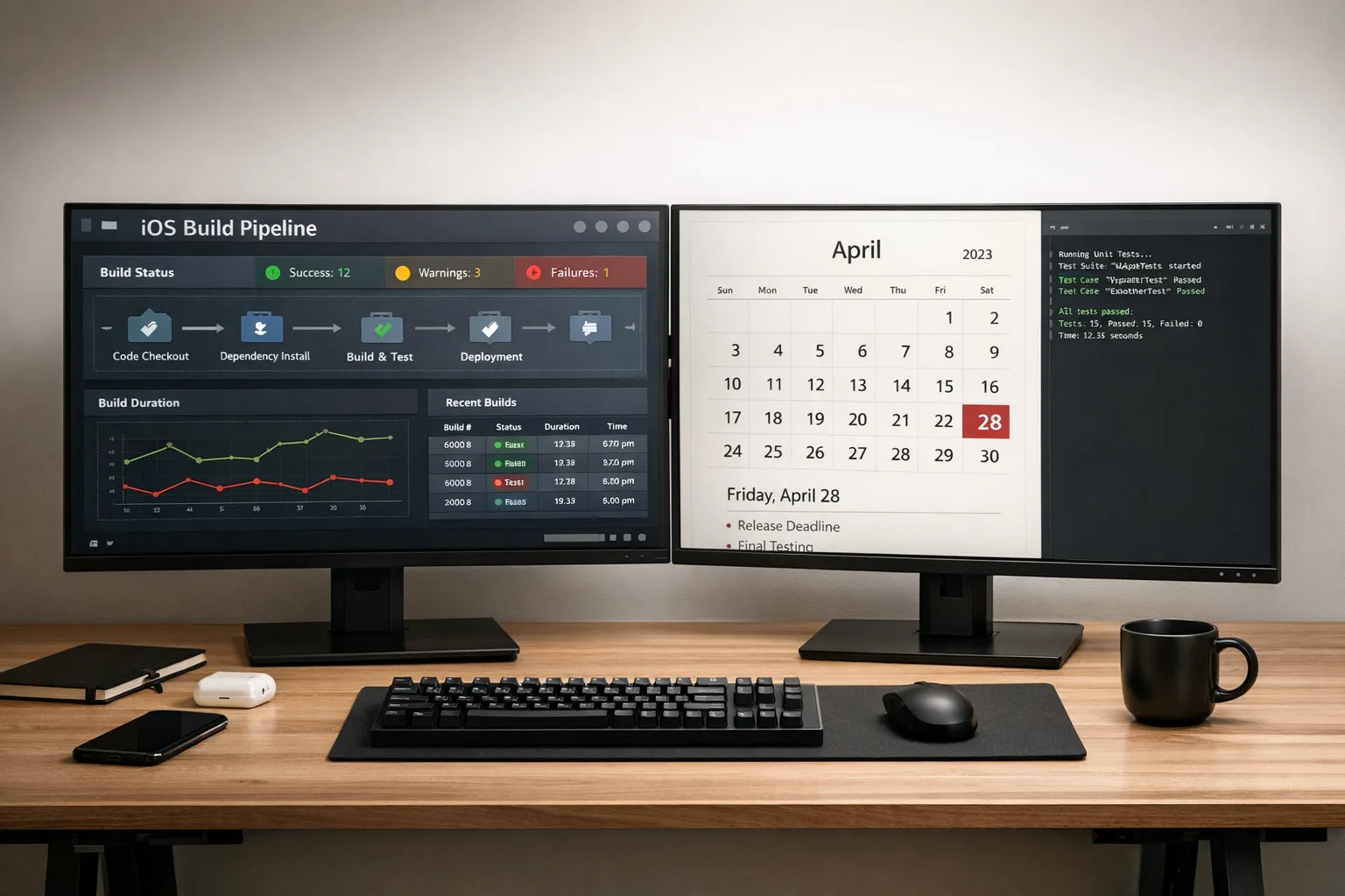
Day 9: QA matrix
Run a matrix: phone portrait (compact), foldable half‑open (medium), tablet landscape (expanded), plus desktop windowed. Include split‑screen at 50/50 and 70/30. Track three metrics per screen: time to first interaction, visual stability (no popping), and state retention on resize.
Day 10: Store readiness and docs
Update your Play listing with tablet and foldables screenshots. Document size classes in your engineering handbook and CI checks that run layout smoke tests across breakpoints.
Gotchas we’ve already tripped over
Reflection on framework internals. Some analytics or instrumentation code reflects on android.os.MessageQueue. With Android 17’s lock‑free implementation for apps targeting the new SDK, those hacks break. Replace them with supported callbacks or tracing APIs.
“Portrait math” baked into custom views. It’s common to find constants derived from a 360dp width assumption. Those blow up when your view gets 1024dp. Move to percentage‑based or constraint‑driven sizing with sensible mins and maxes.
Dialog‑heavy flows. A stack of nested dialogs feels claustrophobic on a 12‑inch display. Convert multi‑step forms to two‑pane flows. Remember focus order and tab navigation for keyboard users on desktop.
Camera session restarts. Legacy flows that rebuild the session on every mode change stutter on larger canvases. Adopt the smoother transition APIs and pre‑warm pipelines where safe.
Bitmap inflation at expanded widths. Loading phone‑sized bitmaps into tablet grids tanks memory. Load size‑appropriate assets and prefer vector or nine‑patch where possible.
People also ask
Do I really need tablet support if my analytics show only 2%?
Yes—because Android 17 Beta changes the bar for quality on large screens, not just popularity. Foldables and desktop windowing amplify the surface where your app can look broken. Even if usage is modest today, the reputational hit from a non‑resizable, state‑losing UI is out of proportion to the effort required to fix it.
Will my app “just work” if I don’t target Android 17 yet?
Targeting an older SDK delays some behavior changes, but it doesn’t shield you from large‑screen realities. Devices and window managers can force resizable behavior or run your app in size compatibility modes that look and feel off. Treat adaptive support as a product requirement, not a targetSdk timing trick.
What about games—are they exempt?
Some categories and devices may temporarily allow tighter constraints, but the platform direction is clear: better, more adaptable experiences on big canvases. If you build games, test how your rendering pipeline behaves in resizable and multi‑window contexts, and consider separate UX policies for streaming overlays and controllers.
Performance, media, and platform changes you’ll feel
Generational GC in ART. Expect fewer long pauses and lower CPU load when apps churn short‑lived objects (lists, chat streams, image galleries). Don’t rely on it to paper over sloppy allocation patterns; it’s a multiplier on good hygiene, not a replacement.
Lock‑free MessageQueue for targets on SDK 37. This can reduce contention in heavy UI pipelines. If you’ve built custom schedulers, re‑test your assumptions. Avoid peeking into private fields—those invariants are gone.
Camera transitions and media polish. Mode switches that used to momentarily freeze should smooth out when you adopt the new APIs. Validate exposure, focus, and UI control continuity during live resize and rotation, where session restarts were particularly visible.
Modern codec support and loudness controls. Video and audio consistency matters more in split‑screen. If your app plays long‑form media next to a game or a call, test automatic loudness management and ensure your mixer respects platform expectations.
Let’s get practical: a readiness checklist you can use today
Before your next release branch, confirm these items are green:
- Every top‑level screen has compact/medium/expanded specs and screenshots.
- Manifest orientation locks removed where feasible;
resizeableActivityis true; no brittleconfigChangesworkarounds. - Navigation scales: bottom bar → rail → two‑pane, with deep links landing correctly in detail panes.
- State survives rotate, fold/unfold, and live resize during text entry, playback, and checkout.
- Lists and grids load size‑appropriate assets; memory stays within budget at expanded widths.
- No reflection on framework internals; third‑party SDKs vetted for Android 17 Beta compatibility.
- Camera/media paths validated for smooth transitions and consistent loudness policies.
- QA matrix run on phone, foldable, tablet, and desktop‑style windowing; split‑screen verified at 50/50 and 70/30.
- Play listing updated with tablet/foldable screenshots; marketing copy avoids phone‑only language.
What to do next
Here’s a tight plan for the next two weeks:
- Enroll one Pixel test device in Canary and another in Beta; wire both into your CI smoke tests that launch across three window size classes.
- Schedule a design review solely for medium/expanded layouts; approve navigation model switches and dialog replacements.
- Run a “rotation and resize gauntlet” on the top five revenue‑critical screens and log defects tied to state loss or visual instability.
- Upgrade instrumented traces around input and scroll; watch for missed-frame spikes during live resize and pane swaps.
- Cut a tablet/foldable screenshot set and update your store listings before your next staged rollout.
Related deep dives from our team
If you want to go further on the specifics, our breakdown of the new large‑screen rules walks through the orientation and resizability nuances with examples. Our developer checklist for Android 17 Beta covers CI gates and layout linting in more detail, and the ship‑ready guide to large screens includes real device matrices and test heuristics you can copy‑paste into your QA doc. If you’re planning a broader refresh or a mixed iOS/Android push, see what we do for mobile product teams.
Zooming out
Android 17 Beta makes one bet: screens will keep getting bigger and more flexible, and great apps must feel at home on all of them. The immediate work is unglamorous—breakpoints, rails, panes, state, and performance—but it pays compounding dividends. Teams that treat adaptive as a core product competency will ship faster, with fewer regressions, as the platform tightens the screws in future releases.
If you’re behind, don’t panic. Start with the top five user journeys, make them bulletproof across size classes, and work outward. Your users won’t reward perfection in week one, but they’ll absolutely notice when your app doesn’t flinch as they unfold a device, dock a keyboard, or snap a window. That’s the bar now—and it’s achievable.


Comments
Be the first to comment.