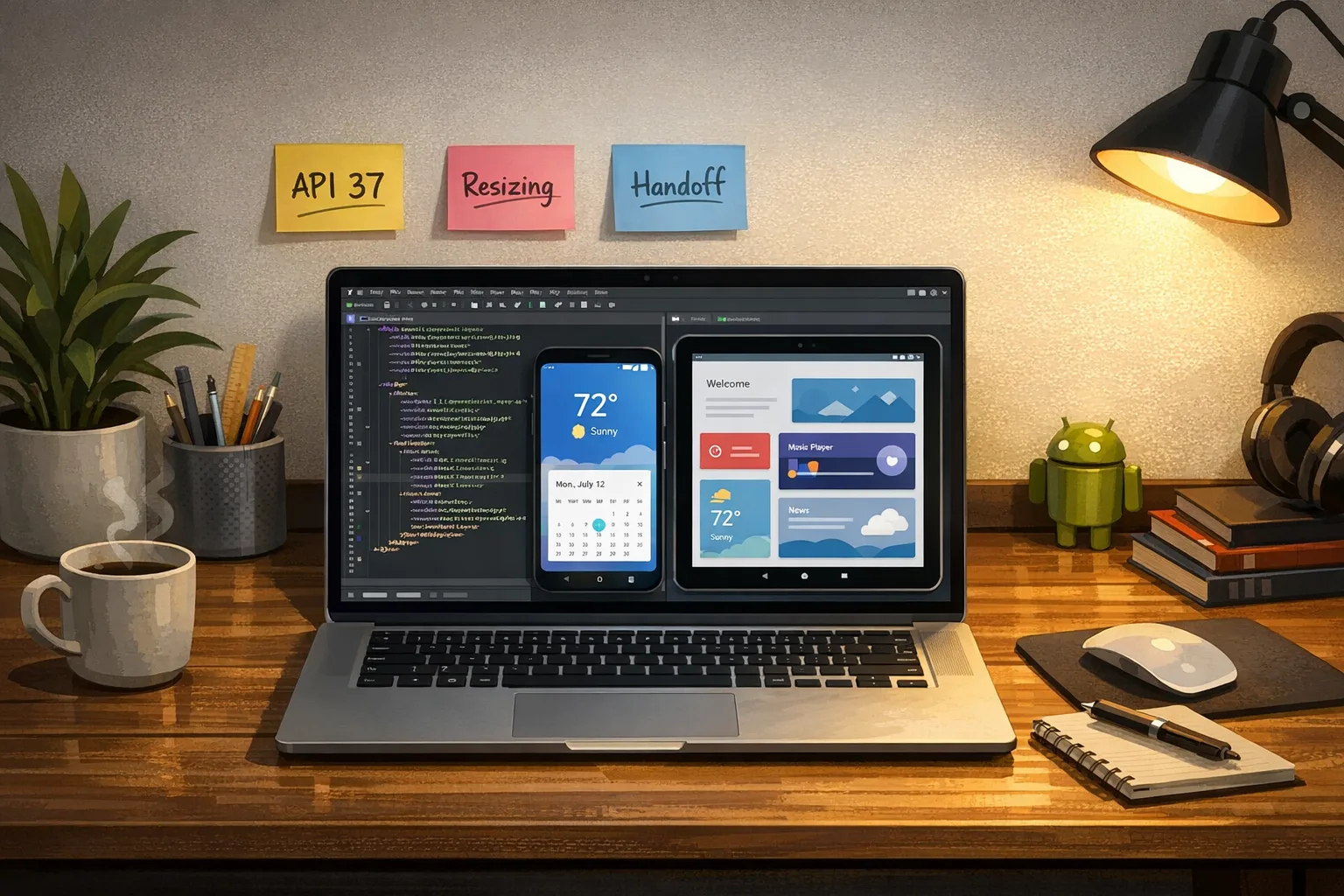
Android 17 Beta 2: Ship Adaptive Apps Now
Android 17 Beta 2 raises the floor for modern Android experiences. If your roadmap still treats tablets and foldables as edge cases, this release will force your hand. The headline for teams: Android 17 Beta 2 introduces cross-device app handoff and makes large‑screen adaptivity effectively mandatory. Treat this as your last call to fix resizing, continuity, and media pipelines before platform stability lands in March 2026. The clock’s ticking.

What’s new in Android 17 Beta 2—without the fluff
Here’s the thing: Beta 2 isn’t a cosmetic update. It signals how Google expects Android apps to behave going forward, especially on large screens and across devices. The practical changes you’ll feel in engineering and QA this month:
- Mandatory large‑screen adaptivity: Apps targeting Android 17 (API 37) can’t opt out of resizing and orientation flexibility on tablets and foldables. If your UI assumes a single portrait phone, you’ll see broken layouts, clipped modals, and navigation dead ends.
- Cross-device app handoff: Start an activity on one device and continue on another—phone to tablet, tablet to phone. Users will expect state continuity, auth continuity, and sensible back stack reconstruction.
- New windowing affordances: A more capable bubbles/windowing model for multitasking, especially noticeable on large screens.
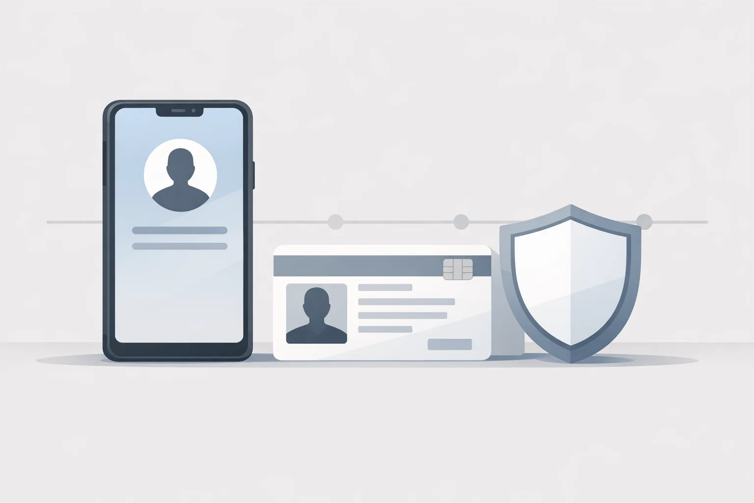
- Privacy & security updates: A tighter contact picker, stronger OTP safeguards, and new guardrails on local network access. Expect more runtime prompts and stricter background access rules.
- Media stack updates: Professional‑grade VVC (H.266) support and camera API refinements for smoother sensor transitions and consistent loudness handling across apps.
If you’ve been following the canary-era changes, the direction is consistent: fewer escapes from adaptive layouts, faster delivery of platform features, and stricter baseline behaviors for user trust. For background, see our take on the Canary‑era shift in Android 17 and how it reshaped developer timelines.
Primary keyword: Android 17 Beta 2—what breaks first
When teams drop a beta build onto a Pixel and call it a day, the first wave of bugs tends to cluster around three areas. Use this list to organize your triage board.
- Window resizing and posture changes: On foldables, the hinge posture toggles between narrow and wide layouts, and multi‑window will squeeze your app into compact width. If your constraints only anticipate 360–411dp widths, toolbars and sheets will misbehave.
- Navigation and state restoration: Cross-device handoff can relaunch activities with new intents on a warm process. Weak saved state hygiene (e.g., assuming a cold start) will drop pending flows like checkout or media casting.
- Media and camera transitions: Switching lenses or surfaces now invokes more robust transitions. If you handle camera per‑screen with fragment swaps, expect jank, double inits, or leaked sessions.
Let’s get practical: an adaptive-first upgrade playbook
You’ve got weeks until platform stability. Here’s a focused plan to ship something resilient while there’s time to iterate. Assume you’re on API level 37 for target builds, Jetpack Navigation (or Navigation Compose), and Material 3.
Week 1: Lock in responsive scaffolding
Start with a ruthless layout audit. On phones in portrait, test 320–600dp widths. On tablets, hit 600–1240dp. On foldables, toggle compact/medium/expanded width classes and posture states. In Jetpack Compose:
- Adopt window size classes to branch UI density (e.g., list‑detail on medium+, column/rail behavior on expanded).
- Replace absolute sizes with adaptive slots: navigation rail vs bottom bar, persistent side sheets vs modal sheets.
- Introduce a two‑pane scaffold for medium+ widths. Treat it as the “true” primary layout, not a nice‑to‑have. Add a single‑pane fallback for compact.
Snapshot and diff your layout tree as you resize. If you still rely on constraint chains or hard‑coded paddings calculated for 411dp, migrate to container queries or Compose modifiers that read the parent constraints.
Week 2: Cross-device handoff that doesn’t lose carts
Continuity is unforgiving when money or media is involved. Build for handoff like a mid‑stream deep link, not a cold start:
- Persist lightweight session state at every navigation boundary. In Compose, use a SavedStateHandle for primitive fields and IDs. Anything heavy (bitmaps, streams) should be rehydrated from a repository keyed by that ID.
- Make flows re‑entrant. If the user is two steps into checkout on phone and hands off to tablet, land them at the same step with the same validation results. That means deriving UI solely from state, not one‑off side effects.
- Re‑bind authenticated context fast. If the user is signed in on device A and shares a session token with device B, design a trust, then verify pattern: provisional access for a few seconds while the token refresh completes, then enforce full policy. Avoid a blank screen while you “think.”
- Rebuild the back stack deterministically. Don’t linearly replay transitions. Construct target back stacks based on the current state tree to avoid surfacing dead routes.
Document handoff contracts like you would a deep link: required params, optional params, and failure affordances. QA should be able to replay a handoff with a single intent payload.
Week 3: Media, camera, and privacy passes
Large screens expose every glitch your phone UI can hide. Stabilize the feel of your app across devices:
- Camera transitions: Centralize camera lifecycle and reuse surfaces when switching sensors. Keep preview and capture lifecycles separate; don’t tear down a session to swap lenses if you can avoid it.
- VVC (H.266) decisions: Only enable VVC where device hardware decode exists and your downstream pipeline—analytics, CDN, editing—supports it. Measure energy draw on mid‑range tablets; VVC wins on bitrate but can cost on CPU if you fall back to software decode.
- Privacy controls: Revisit contact‑picker and OTP flows. Assume stricter access and treat SMS/contacts as opt‑in features with graceful no‑permission paths.
The adaptive test matrix: what great teams actually run
If you’re short on devices, borrow or rent. You’ll spend more time debugging a single skew than the cost of a test lab. Minimum viable matrix for Android 17 Beta 2:
- Phones: Small (5.8–6.1″), large (6.7″), both at 360–480dp logical widths. Test portrait/landscape, and multi‑window at 50/50 split.
- Foldables: Book‑style with inner display, posture changes (half‑open), and cover display narrow width. Validate handoff mid‑gesture.
- Tablets: 8–11″ and 12–13″ at 1280–1600dp widths. Force‑resize between medium and expanded classes. Try external keyboard + trackpad.
- Continuity: Phone→tablet and tablet→phone while in the middle of: composing a message, viewing a product detail, and at checkout step 2 of 4. Inspect back stack and restored state each time.
- Accessibility & input: TalkBack focus order after resize, large fonts (1.3–1.5x), and stylus interactions on tablet. Bubble UI should remain keyboard navigable.
Track results by feature, not device. A healthy dashboard reads like “Resize-safe: Search, PDP, Cart—pass; Chat—clipping bug on 50/50 split; Camera—lens swap jank on tablet.”
Design rules that survive every screen
When in doubt, simplify. These rules have kept our client apps stable across three major Android releases and every new form factor:
- One source of layout truth. Route all size decisions through a single window size classifier and keep UI trees declarative. If two components compute breakpoints independently, they will drift.
- Make navigation stateless. Back stacks should be derivations of state, not the store of state.
- Prefer persistent scaffolds. On medium+ widths, a two‑pane or three‑pane scaffold eliminates modal churn and makes bubbles mostly unnecessary.
- Keep media async and interruptible. Every capture, upload, and encode step should survive a resize, pause, or handoff without user‑visible failure.
People also ask
What breaks when you ignore large‑screen adaptivity?
Navigation first. Any flow that depends on a full‑screen modal will struggle when a tablet or foldable forces a split or a rail layout. Next is surface hierarchy: snackbars and sheets designed for compact widths collide with rails and side sheets at medium/expanded widths. Finally, typography and hit targets tend to shrink as density rises; if you didn’t test at 1.3x/1.5x font scales, you’ll blow past accessibility baselines.
How do I test cross‑device app handoff in Android 17 Beta 2?
Treat it like deep linking between two live sessions. Launch the target activity with a minimal payload that can rebuild the state tree: user ID, route, and item IDs. Don’t pass heavy objects. Validate that the receiving device reconstructs the same UI state and back stack, then verify idempotency by sending the same handoff twice in a row. Add analytics events around start, accept, reconstruct, and ready, so you can see drops.
Do I have to adopt VVC right now?
No. If your audience is phone‑heavy and your CDN pipeline is H.264/H.265 optimized, you can defer. But do test VVC on mid‑range tablets and newer phones to establish a floor for quality and battery impact. If you ship any professional media features, have a toggle you can enable per device tier once you’re confident in decode performance.
The policy and platform angle you can’t skip
Google’s been tightening minimum target API levels and is signaling a future where resizing and large‑screen support are table stakes. If you’re multi‑platform, you’re juggling Apple’s April 28, 2026 Xcode requirement at the same time. Ship your iOS toolchain updates without drama using our practical April 28 plan while your Android squad executes the adaptive push.
Want broader context on the risk profile for Android 17’s new rules? Read our earlier field notes on the rules, risks, and a plan. If you need hands‑on help to move layouts, refactor navigation, or build a continuity‑safe state layer, our mobile modernization services are built for exactly this sprint.

Engineering checklist: pass Beta 2 with confidence
Use this checklist verbatim in your PR template for the next three weeks. It’s short by design and covers the hotspots most teams miss.
- Targeting: Build a beta channel targeting API level 37 with feature flags for handoff, bubbles, and VVC.
- Layouts: Prove list‑detail on medium+ widths; enforce a single source of breakpoint truth and remove absolute dp assumptions.
- Navigation: Replace any implicit back stack dependencies; every route reconstructs from a serializable state bundle.
- State: SavedStateHandle coverage for all ongoing flows; repository rehydration paths are idempotent and fast.
- Privacy: No‑permission paths for contacts and SMS OTPs; runtime prompts explained in‑context.
- Media: Camera transitions reuse surfaces; optional VVC with a safe fallback; energy draw tested on a mid‑range tablet.
- Continuity: Phone↔tablet handoff for three critical flows (messaging, product detail→cart, media capture→preview) with analytics checkpoints.
- QA devices: One small phone, one large phone, one foldable, two tablets (11″ and 13″).
Red flags and quick wins
Red flags: hard‑coded heights for bottom sheets; nested scrollable parents that conflict after resize; one‑off camera initialization tucked inside a fragment; ad SDKs that assume portrait phones; deep links that bypass authentication and crash when handoff reconstructs a later step.
Quick wins: standardize two‑pane scaffolds and rails on medium+ widths; migrate any leftover ConstraintLayout breakpoints to Compose size classes; introduce a continuity handshake that preloads user/account state before recreating the UI tree; add retryable repositories for uploads so users don’t lose work on resize or device switch.
What to do next
- Today: Cut a Beta 2 branch targeting API 37. Turn on feature flags for handoff and adaptive layouts.
- This week: Ship the Week 1 scaffolding work and publish a test plan using the matrix above.
- Next 10 days: Complete continuity flows and camera/media passes. Add analytics for handoff checkpoints.
- By platform stability (March 2026): Merge to main, enable adaptive layouts by default, and run a full tablet/foldable regression. Tag a candidate release.
Zooming out, Android 17 Beta 2 isn’t just another beta. It’s the line where “phone‑only” thinking finally breaks. Teams that embrace adaptive layouts and continuity will look polished on day one of the stable release. Teams that don’t will watch users multitask their way around broken modals and abandoned carts. Choose which side of that line you want to be on.
If you need a seasoned partner to push this over the finish line, we’ve shipped these upgrades under real deadlines. Start the conversation on our services page or browse outcomes in our client portfolio. Then get back to the code—the platform won’t wait.


Comments
Be the first to comment.