Android 17 Beta: Large‑Screen Rules and How to Adapt
Android 17 Beta landed the week of February 13, 2026, and it comes with one policy‑level change that matters more than any launcher tweak: large screens are done tolerating apps that refuse to resize or rotate properly. On devices with a smallest width of roughly 600dp and up—think tablets and most foldables—Android 17 can ignore your manifest locks and runtime orientation calls. If your product strategy still banks on portrait‑only layouts, it’s time to update that strategy. This is the moment to treat large‑screen quality as a release‑blocking requirement, not a backlog item.
Android 17 Beta: what exactly changes on large screens?
Android 17 (API level 37) tightens large‑screen behavior by treating several orientation and resizability settings as suggestions—ones the system can override. On screens at or above the typical 600dp smallest‑width threshold, values you’ve relied on in the manifest and at runtime may be ignored so the app can resize, rotate, and occupy available space. In practical terms, that means letterboxed, pillar‑boxed, or orientation‑locked experiences that feel like stretched phone UIs will get far less leeway.
Here are the two rules of thumb you should assume when testing on tablets and foldables running Android 17 Beta:
- If you previously forced orientation (for example, portrait only), don’t count on that sticking on large screens.
- If you opted out of resizing or constrained aspect ratios, expect the system to treat your activity as resizable anyway.
Importantly, this enforcement targets large screens; traditional phones under that threshold aren’t subject to the same override behavior. That said, you should still verify behavior across phones with display scaling turned up, as some UI assumptions break earlier than expected when text or display size increases.
Why Google is doing this (and why you should be glad)
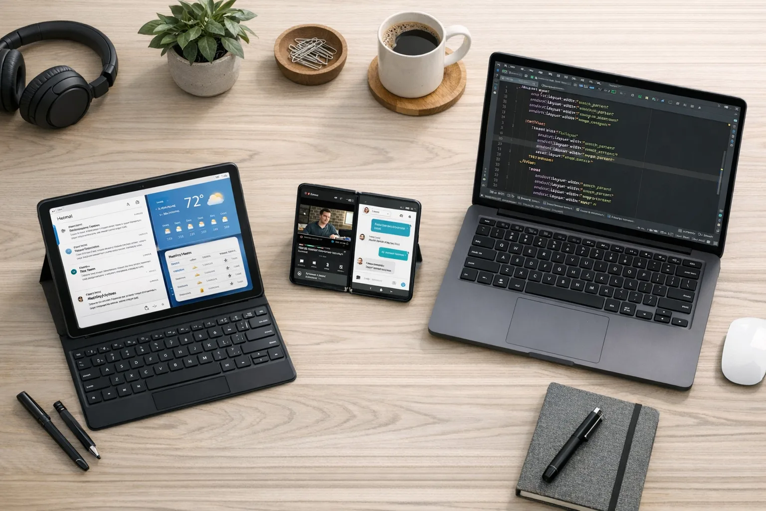
Let’s be honest: too many Android apps still look like narrow columns awkwardly floating in the middle of a 10‑inch canvas. That harms discoverability, engagement, and even ad yield. For Google to hit its hardware ambitions with tablets, foldables, and desktop‑adjacent modes, the platform needs app quality that respects width, not just height. Enforcing adaptivity nudges the ecosystem toward patterns that have been available for years—window size classes, multi‑pane layouts, and composables that scale naturally—without forcing you to drop support for phones.
How to tell if your app is at risk in 10 minutes
You don’t need a lab day to triage. Do this quick pass on a Pixel Tablet or a recent foldable (or an emulator configured at ≥600dp):
- Open your flagship flows—onboarding, home, primary detail screens, and checkout.
- Rotate the device and drag split‑screen dividers to resize while in multi‑window.
- Watch for clipped components, cropped images, toasts falling off edges, and FABs overlapping system UI.
- Check your video player and camera surfaces for aspect‑ratio weirdness.
- Turn display size and font size up two notches and retest the same flows.
If anything breaks in those five minutes, assume Android 17 will surface it to real users.
Let’s get practical: a large‑screen migration playbook
You don’t need a rewrite. You need focused, high‑leverage changes. Here’s the approach we coach teams to take when preparing for Android 17 Beta and the months that follow.
1) Compile with the latest SDK, target with intent
Adopt compileSdkVersion 37 as early as your toolchain permits so you can run lint checks and try the new behavior. You can raise targetSdkVersion after you’ve resolved layout and permission prompts affected by the newer SDK. Shipping with a modern compileSdkVersion doesn’t force you to drop older minSdkVersion; it just gives you the right warnings and behaviors at build time.
2) Embrace Window Size Classes and WindowManager
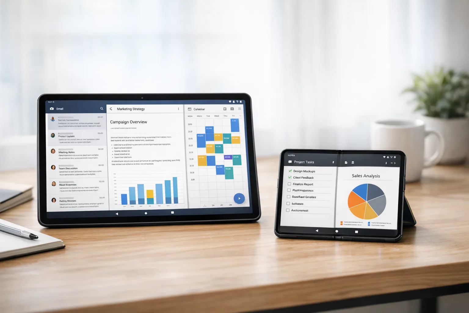
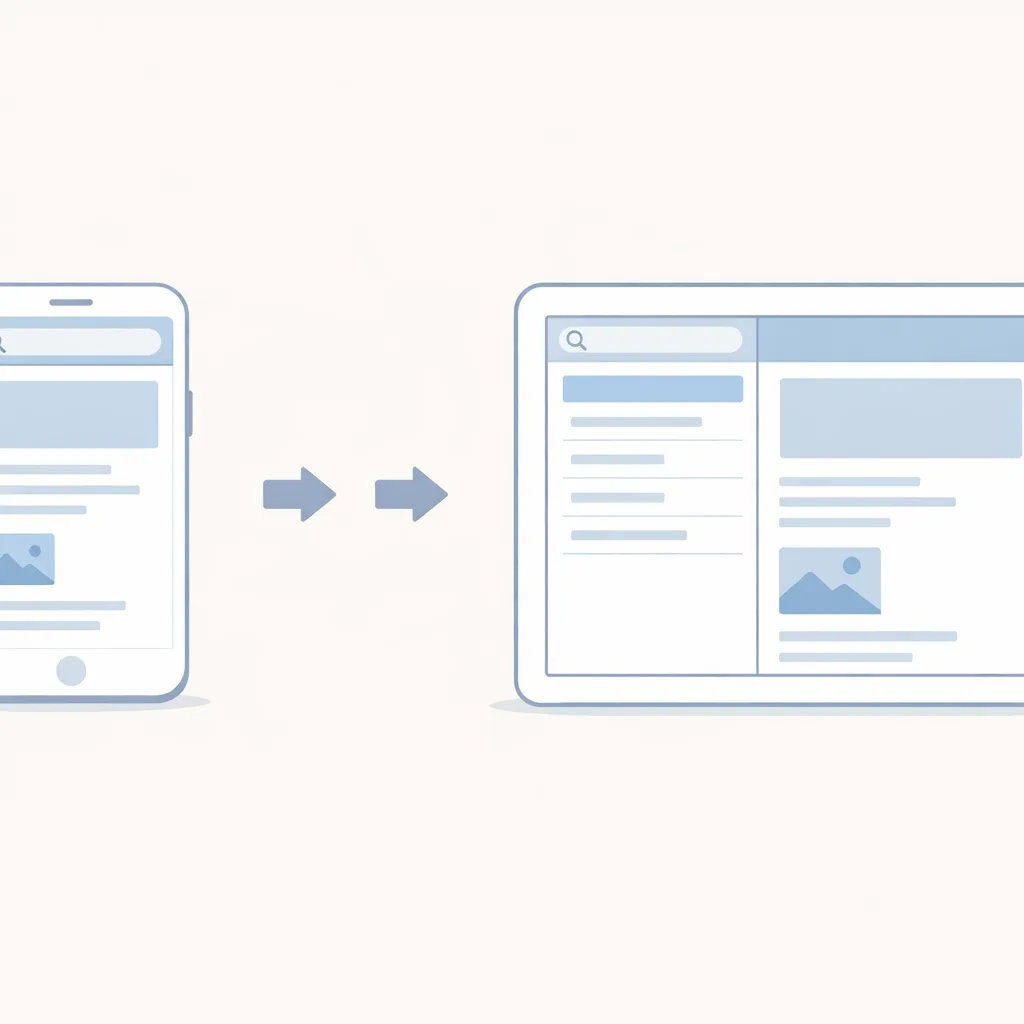
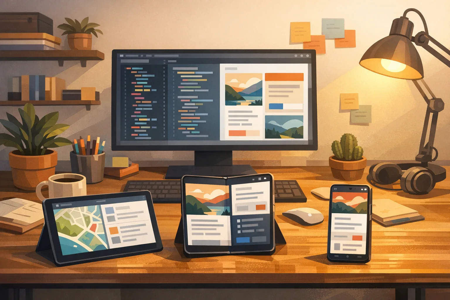
Stop keying layouts off orientation alone. Use WindowSizeClass (or calculateWindowSizeClass in Compose) to branch between compact, medium, and expanded width buckets. On expanded, switch to a two‑pane layout: list on the left, detail on the right. The Jetpack WindowManager library also exposes folding features and hinge positions so you can avoid rendering controls across a physical crease.
3) Replace orientation locks with adaptive UIs
If you’re currently forcing portrait to hide layout weaknesses, replace that crutch with responsive design. Prefer constraint‑based, weight‑based, or grid‑based layouts that gracefully reflow. In Compose, that often means swapping a column for a responsive grid and moving from absolute sizes to Modifier.weight and AspectRatio.
4) Make multi‑window a first‑class citizen
Users on large screens run your app side by side with chat, mail, docs, and video. Validate that your navigation stack and dialogs honor size changes without tearing the activity down in ways that lose state. Keep bottom sheets and snackbars in‑bounds, and avoid full‑screen dialogs that feel jarring when the window is only half the display.
5) Focus on detail panes, not pages
When width allows, show more, not bigger. A secondary pane with context—filters, related items, or metadata—turns a stretched phone UI into a true tablet experience. Keep keyboard and touch targets sensible; bigger is not always better when the user’s thumbs don’t reach the center comfortably in landscape.
6) Audit media, camera, and map surfaces
Large surfaces are where aspect‑ratio mismatches scream. Use letterboxing intentionally where content is authored for a fixed ratio, but never let controls drift outside the content bounds. On camera, confirm preview and capture streams are negotiated correctly when the surface resizes during orientation changes.
7) Test with accessibility and scaling on
Most layout bugs surface instantly when text size increases. Run TalkBack, try bold text, and crank font size up. Larger screens are popular with users who need those settings; design with them, not despite them.
A simple 7‑step Large‑Screen Adaptivity Audit (LSAA)
Here’s a concise checklist you can paste into your sprint board. If you complete this, you’ll be in good shape for Android 17’s new behavior:
- Enable size class logging in your app start‑up and confirm which buckets your top flows hit across tablet, foldable outer screen, and inner screen.
- List all orientation locks and runtime calls (e.g., setRequestedOrientation), then remove or isolate them to phone‑only experiences.
- Add a two‑pane layout for your primary list‑detail flow using SlidingPaneLayout or Compose equivalents.
- Validate multi‑window by running side‑by‑side with common apps; fix dialogs, sheets, and snackbars that misplace themselves.
- Fix navigation back stack so that swapping panes doesn’t recreate fragments or drop scroll position.
- Resize‑proof media: confirm video, camera, and map surfaces keep aspect and control overlays anchored.
- Run accessibility passes with display size and font size increased; fix clipping and hit targets below 48x48dp.
Data points worth pinning on your roadmap
Use these as anchors when planning releases and QA:
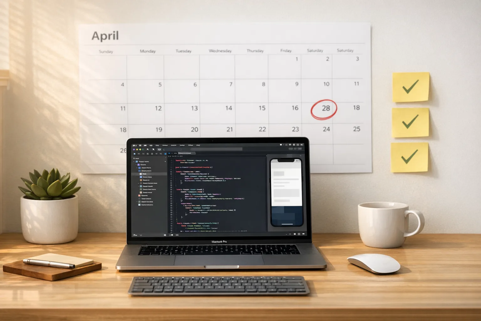
- February 13, 2026: Android 17 Beta 1 became available. Expect additional betas in spring, with final release timing historically landing in late Q2 or early Q3.
- API level 37: Build and test against the new APIs to catch behavior changes early, especially around resizability and orientation handling on large screens.
- Large screen scope: Enforcement focuses on tablets and foldables (≥600dp smallest width). Phones below that threshold are not subject to the same overrides.
If you run a cross‑platform team, note that iOS has its own spring 2026 submission changes. Our ship‑ready playbook for iOS deadlines covers those dates and their impact on release trains. Coordinate Android 17 testing with any Apple tooling upgrades so your QA cycles don’t collide.
People also ask: will my app break if I do nothing?
If your layouts already adapt to width, you’ll be fine. If you rely on orientation locks or non‑resizable activities, expect your UI to look wrong or behave inconsistently on Android 17 devices with large screens. That can mean clipped controls, unreachable buttons, dialogs that render off‑canvas, or video that warps when windows resize. None of those are instant “crash” failures, but they are expensive in support tickets, poor ratings, and churn.
Do I have to retarget Android 17 right now?
No, but you should compile and test against it now. Raising targetSdkVersion can wait until your layout changes are stable and any permission or background behavior changes are addressed. The point is to spot issues early, not to rush a targetSdkVersion bump into production the same week as Beta 1.
What about games and specialized apps?
Most of the pain shows up in content‑driven and productivity apps because users expect responsive panes and split views. Games often manage orientation and rendering through engines that already handle resize events, but they still need testing—especially on foldables where window changes can be sudden and frequent. If you ship a kiosk or single‑purpose experience, validate policy expectations for the form factors you support and document any carve‑outs carefully.
Release management: a steady cadence beats a big‑bang rewrite
Don’t defer this work to a heroic “tablet sprint” in June. Push changes behind feature flags, ship to a small percentage of users on tablets and foldables, and iterate. Collect screenshots and logs automatically when layout assertions fail. Encourage your support team to tag tickets by device class so you can see issues concentrate on foldables or tablets as you roll out.
Also, review your store listing assets. If you genuinely improve large‑screen UX, show it. Add tablet screenshots, foldable inner‑screen shots, and mention split‑screen support explicitly. That clarity helps discoverability and gives your marketing team something concrete to talk about.
Engineering pitfalls I keep seeing—and how to avoid them
Hidden orientation calls
It’s not just the manifest. Teams sometimes call setRequestedOrientation deep in a library or base activity. Search the whole codebase. If a third‑party SDK forces orientation, wrap it behind an interface and no‑op the call on large screens.
Single‑pane navigation assumptions
Two‑pane layouts expose navigation bugs fast. If your detail screen assumes full‑screen ownership, it may fight the list pane for focus or re‑create fragments mid‑gesture. Make selection drive detail state instead of launching a separate activity stack.
Dialogs that don’t scale
Alert dialogs and bottom sheets that looked fine on phones can feel comically large or float off‑center on tablets. Use width‑bounded containers, prefer inline surfaces where context matters, and keep maximum heights sensible.
Resource churn on resize
If resizing causes a cascade of restarts, cache view models and hoist state so recomposition or configuration changes don’t dump user progress. Treat orientation and window changes as first‑class events, not exceptional ones.
A quick field note on Compose vs. Views
You don’t have to migrate to Compose to succeed here, but Compose makes the job easier. Responsive grids, adaptive navigation, and pane swaps are less brittle when state is explicit and UI is declared in code. If you’re mid‑transition, focus Compose on the layouts that benefit most from width and multi‑window: list‑detail, dashboards, and media galleries.
Security and privacy side‑quests you shouldn’t skip
Large screens increase the odds your app runs side by side with sensitive content. Re‑audit screenshot redaction, clipboard access, and notification previews. On shared tablets, make sure sign‑out and clear data flows are obvious. If you handle payments, test 3‑D Secure prompts and custom tabs in split‑screen; some flows assume full‑screen and end up hidden behind panes.
What to do next (this week)
- Spin up a tablet and a foldable emulator, plus one real device if possible, and run the 10‑minute triage above.
- Set compileSdkVersion 37 on a branch and fix the first five layout issues you see.
- Add a two‑pane layout for your primary list‑detail flow and hide it behind a remote flag for staged rollout.
- Record tablet and foldable screenshots and prep store listing updates announcing large‑screen support.
- Schedule a recurring, 30‑minute large‑screen review in sprint planning until Android 17 reaches platform stability.
Need a partner?
If you’d like an outside team to pressure‑test your UX and wire in size‑class‑driven layouts, our mobile engineering services cover responsive design, performance audits, and release management. If you want a primer on the bigger release‑train picture across iOS and Android this spring, start with our Android 17 Beta breakdown and the iOS counterpart in our App Store Connect ship‑ready playbook. When you’re ready to move, talk to us—we’ll help you ship with confidence.
Zooming out
Android 17 Beta doesn’t introduce the idea of responsive Android apps; it enforces it where it matters most. That’s good news for users and for businesses that invest in quality. Teams that move now will win distribution on tablets and foldables, earn better ratings, and simplify their code by deleting brittle orientation hacks. Teams that wait will be cleaning up support queues in June. Your call.
Comments
Be the first to comment.