UI/UX and branding design for products that need to convert
Your buyers are not judging your stack, they are deciding whether they understand you, trust you, and can complete a task without friction. If onboarding feels heavy, pricing is unclear, or your brand looks stitched together, you pay for it in churn, sales friction, and support tickets.
BYBOWU is a product design and development agency based in Phoenix, AZ, partnering with SaaS, marketplaces, ecommerce, and services businesses across the US and globally. We design UI/UX, websites, and visual identities that support revenue, not just aesthetics, and that your engineers can ship without rewrites.
Where UI/UX and brand problems usually show up
Most teams call us when design issues start turning into real numbers in analytics, sales calls, or support queues.
- The product technically works, but new users get lost, abandon onboarding, and ask the same basic questions.
- Website, app, pitch decks, and ads all feel like different companies, so it takes longer to build trust.
- Traffic and acquisition costs look fine, yet demos, trials, or purchases are flat and no one can isolate why.
- Design files are messy, developers guess states and behaviors, and each release adds new inconsistencies.
- Leadership hears "the UX is confusing" but there is no clear, phased plan to fix it without halting the roadmap.
Our role is to replace that with a clear story, intuitive journeys, and a design system that keeps product and brand aligned as you ship.
How we approach UI/UX and branding design
We treat design as a product discipline. That means measurable goals, short feedback loops, and assets that are ready for engineering, not just slides.
-
Discovery and UX diagnosis
We start with a focused review of your product, site, and brand assets, plus analytics, funnels, support logs, and sales feedback. Together we pick the journeys that matter most right now, such as onboarding, pricing, checkout, bookings, or lead capture, and define what success should look like in metrics. -
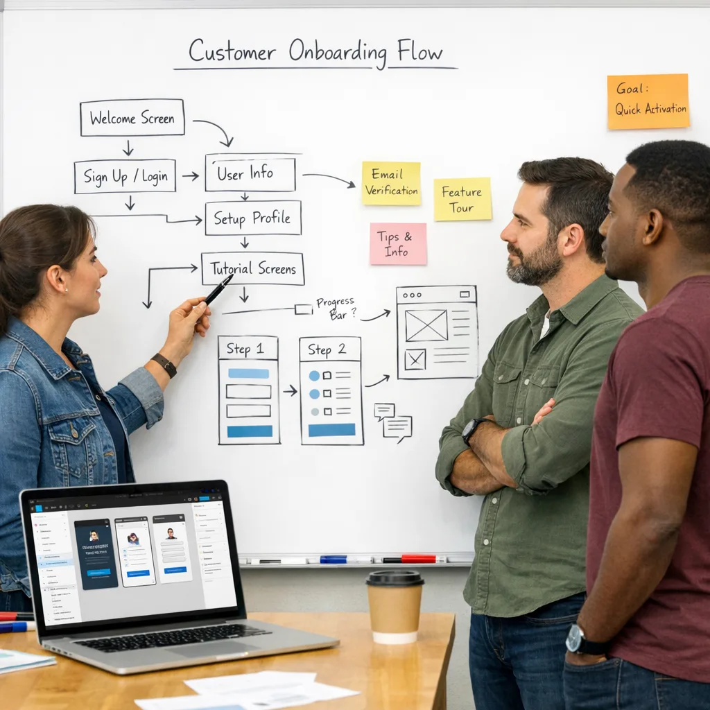
Information architecture and wireframes
We map user journeys, states, and navigation, then create low-fidelity wireframes so your team can react quickly. This is where we align on edge cases, permissions, and tradeoffs before visual polish, and where we often involve our Website UX Audit & Optimization or UI/UX Design specialists for complex flows. -
Visual identity and UI direction
Once flows are agreed, we define or refine your visual language: logo and marks when needed, typography, color, layout rules, and core UI components. The goal is a flexible system that works across web, product UI, mobile, email, and sales collateral, not a single homepage layout. -
High-fidelity UI and interactive prototypes
We bring key journeys to life in Figma with real content, interactions, and responsive behavior. Stakeholders can click through realistic flows, settle disagreements early, and sign off on what will actually be built. For marketing and product sites, we often pair this with our Website Design, Custom Website UI/UX Design, or Figma Prototyping services. -
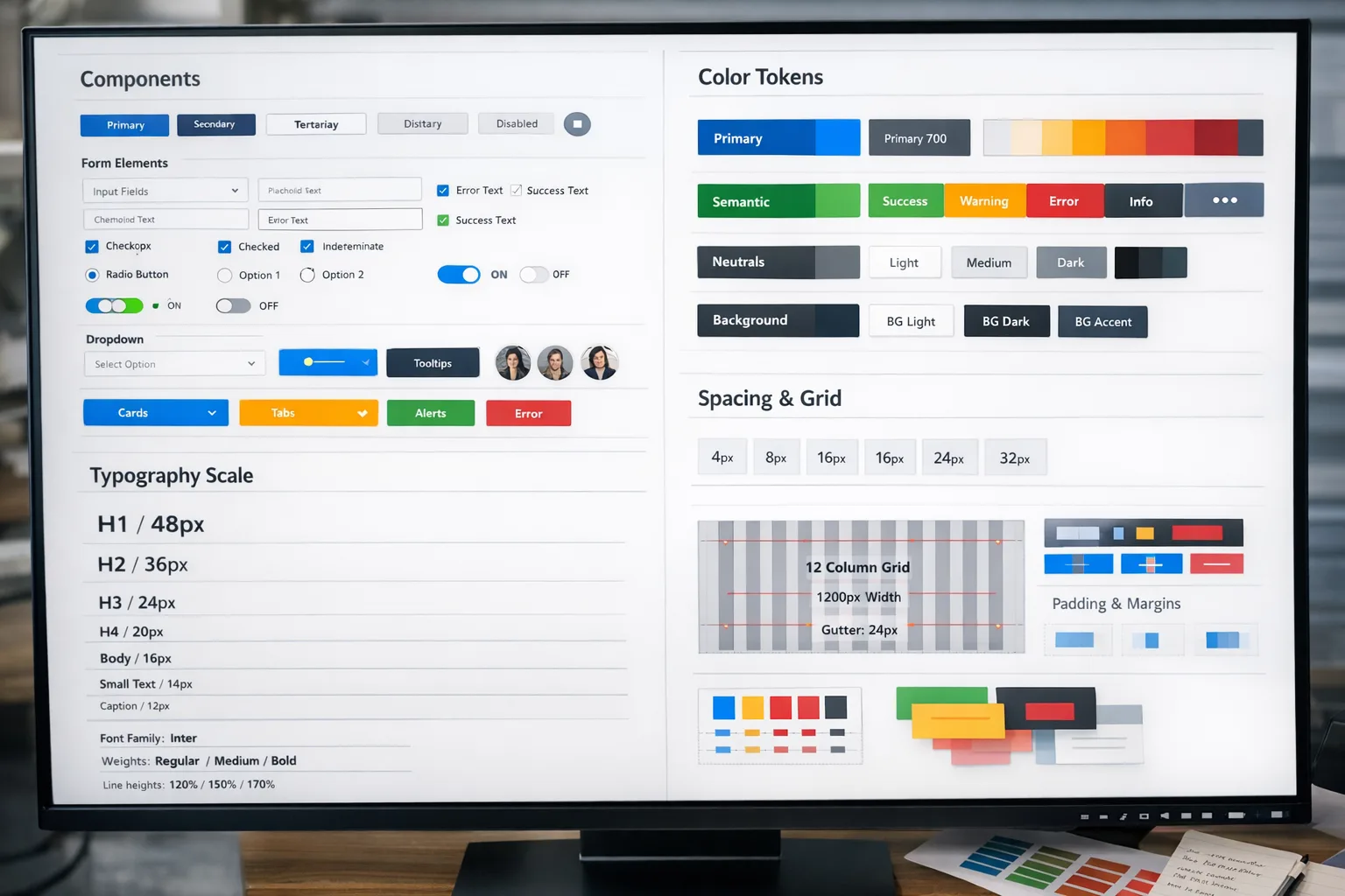
Design system and dev handoff
You get a structured component library, design tokens, and implementation notes. We collaborate with your developers or our own Web Development and Mobile App Development teams so what ships in React, Next.js, Laravel-based frontends, Webflow, WordPress, or mobile frameworks matches the agreed design.
What you can order
- Conversion-focused website UI/UX — sitemap, key user flows, wireframes, and polished page designs for lead-gen or marketing sites, ready for handoff to our Web Development, Webflow Development, or WordPress Development teams.
- SaaS app and dashboard UX — user journeys, interaction patterns, and a reusable component library for web apps, analytics dashboards, and admin tools, often paired with Dashboard & Web App Design or SaaS Product Development.
- Mobile app UI/UX — core flows, screen designs, and interaction patterns for iOS, Android, or cross-platform apps, tailored for teams shipping with React Native or Flutter and supported by our Mobile App UI/UX Design and Mobile App Development services.
- Brand identity and logo system — logo, color palette, typography, and practical rules packaged as a brand kit or full brand book. Often combined with Logo & Brand Identity Design, Corporate Branding & Visual Strategy, or Brand Book & Visual Identity Development.
- Landing page and funnel design — focused page layouts, hero messaging, and on-brand assets that improve conversion and ROAS for specific campaigns, with variants ready for A/B tests. Frequently combined with Conversion-Focused Landing Page Design and Landing Page Development & CRO.
- Design system build-out — audit of your existing UI, definition of tokens, components, and usage rules, plus setup of a scalable design system in Figma that keeps product, marketing, and brand aligned. Often includes Design System Services, Figma Component Library, and Accessibility & WCAG Compliance support.
What you actually get as deliverables
Every engagement ends with assets your team can build on, not static files that sit in a folder.
- Clickable Figma prototypes for core flows like onboarding, pricing, search, checkout, or booking, with realistic content and key interactions documented.
- Component-based UI library including buttons, forms, inputs, cards, tables, modals, navigation, and layout patterns, structured to mirror modern frontends.
- Design tokens and usage rules for color, type, spacing, grid, and elevation that your engineers can map into code so future releases stay consistent.
- Brand assets such as logos in common formats, color and typography specs, examples of usage, and practical guidelines for web, product, and social channels.
- Annotated handoff covering states, validation, empty states, error messages, and responsive behavior for key components and screens.
- Prioritized UX improvement list when we work on an existing product or site, so you know what to tackle next and what metrics to watch.
If you also engage us for web development, ecommerce, or mobile apps, the same senior team stays involved from discovery through launch.
Why choose BYBOWU for UI/UX and branding
- Metrics first, visuals second — we start with your business goals and user journeys, then design flows and interfaces that support qualified demos, paid conversions, and lower support volume.
- Design, engineering, and growth in one place — our UI/UX work is informed by the same people who run SEO & Digital Marketing, Custom Software Development, and AI & Automation, so you do not end up with a beautiful but fragile product.
- Senior attention and honest tradeoffs — you work with people who can discuss UX, architecture, and go-to-market in the same call. We are straightforward about what belongs in phase 1 and where a phased approach will save you budget and risk.
- Systems, not one-off screens — we leave you with reusable patterns, documentation, and design ops practices so your team can keep shipping without reinventing UI every sprint.
- Global-friendly collaboration — we work smoothly with distributed teams across time zones, keep meetings purposeful, and rely on clear async updates so you always know what is happening without living in comments.
Proof it works in the real world
Marketplace UX that feels familiar
For a modern tactical clothing marketplace, we reshaped product discovery, filters, and checkout so users could move from browsing to purchase with less friction, supporting both individual buyers and wholesale teams. See project details.
Simple journeys for complex housing choices
For a roommate-finding platform, we clarified onboarding, profiles, and search filters so users reached relevant matches faster and saw fewer dead-end screens, which also reduced basic support questions. See project details.
Brand presence that matches product quality
For an industrial design studio, we created a visual-first web experience that puts complex hardware projects front and center while keeping navigation effortless on any device. See project details.
From dropshipping rules to usable flows
For a wholesaler and dropshipping platform, we organized dashboards, catalog views, and order flows into a coherent interface so partners could manage inventory and orders without extra training. See project details.
How engagement works with BYBOWU
You are busy, so we keep collaboration predictable and light on ceremony.
- 1. Quick intro call — you share what is not working, your constraints, and where you need a win first. If there is a fit, we agree on a short discovery and UX diagnosis phase.
- 2. Scope, phases, and estimate — you receive a clear proposal with options, timelines, and budget ranges, usually with a focused phase 1 targeting one or two core journeys. Typical ranges are outlined on our Prices page.
- 3. Design in tight feedback loops — we work in short cycles, review Figma updates on focused calls, and document decisions and rationale so stakeholders stay aligned without endless meetings.
- 4. Dev-ready handoff — we prepare structured files, tokens, and notes, then support your developers or our own engineering team during implementation, including design QA on real builds.
- 5. Iterate or extend — once the first release is live, we help you read early data, prioritize next UX improvements, and extend the brand system as your roadmap evolves.
We run most projects fully remote with clients across the United States and worldwide, and we are comfortable joining your existing tools and workflows.
Questions founders usually ask
What kind of budget do we need for UI/UX and branding?
Most focused UX or branding projects start in the low five-figure range and scale with the number of flows, platforms, and how much research or testing you want. If you share your goals and timing, we can usually give you a realistic range within one business day, and you can also review our Prices page.
How long until development can start?
For a marketing site or smaller app, we can usually deliver dev-ready designs for core pages in 3–5 weeks. Larger SaaS products or full rebrands often take 6–10 weeks. When it helps your timeline, we front-load key flows so your dev team can start earlier while we extend the design system in parallel.
Can you work with our existing developers or agency?
Yes. Many clients keep their current engineering partner and bring us in as a dedicated design team. We adapt our Figma structure, tokens, and documentation to your stack, join your existing tools, and stay available for design QA during implementation.
Will the new UX and branding affect SEO or campaigns?
Handled correctly, clearer UX and messaging usually improve SEO and paid performance. We collaborate with our SEO & Digital Marketing and Advertising teams so structure changes, redirects, and new layouts support your organic and paid traffic instead of resetting it.
What tools do you use and will we own the source files?
We design primarily in Figma and organize files into projects, pages, and libraries that your team can understand. You get full access to all agreed Figma files, prototypes, components, and exported assets, so you are not locked to us for future iterations.
Can you also help with analytics or product strategy?
If you need more than design, our team can also handle product analytics implementation, SEO and digital marketing, and IT & product consulting. You can start with design only or set up an end-to-end engagement.
Next step: tell us what needs to work better
You do not need a perfect brief. A link to your current product or site, a short description of who you serve, and your main bottlenecks are enough for a first look.
We will respond with a practical plan, rough timeline, and budget range, usually within one business day.
Contact us for a 24-hour design estimate or request a product and website review.